
AI-Assisted Research for Clinical Alert Intelligence & Transparent Data Synchronization
Project information
- TEAMProduct Manager, Backend & Frontend Engineers, UX/UI Designer (me!)
- TIMELINEJune 2026 – Present · Ongoing
- KEY SKILLSAI-Assisted Research, Notification Systems, Usability Testing, Data Transparency
- PARTNERSHIPSNursing home facilities
- TOOLSFigma, Miro, Maze, Claude AI, Dovetail AI





Project Overview
A nurse adjusted a patient's medication based on a record that hadn't synced from the evening shift. No warning. She found out during handover. This came directly from a research participant during interviews — and it became the clearest articulation of what Phase 2 needed to solve: not better UI, but restored clinical trust. Post-launch analytics confirmed two systemic failures: alerts nurses had learned to ignore, and a sync system so invisible that double-saving had become routine. Phase 2 was designed to fix both.
- The Noise Problem (Alert Fatigue): Critical notifications were lost in a sea of routine updates, leading to staff ignoring alerts, including important ones.
- The Transparency Problem (Sync Anxiety): Invisible sync operations created uncertainty about data state, causing staff to double-save records or call colleagues to verify data accuracy.
The Strategic Solution: Intelligence + Transparency Phase 2 (Ongoing) introduces a twin-pillar architecture designed to restore "Clinical Truth"
- Intelligent Alert Ecosystem: A centralized hub that categorizes, prioritizes, and surfaces alerts based on clinical urgency, with intelligent filtering to reduce noise at the source.
- AWS Sync Transparency: Complete visibility into the synchronization pipeline with explicit sync states (Saving → Syncing → Confirmed).
The AI Advantage: To maintain pace with the ongoing timeline, Claude AI is being used to accelerate research synthesis as interviews are conducted. Dovetail AI supports ongoing usability session analysis.
Background
Following the Phase 1 launch, usage analytics and follow-up interviews surfaced two present pain points that better visual hierarchy alone couldn't address.
| Persisting Problem | Root Cause | Why Phase 1 Couldn't Fully Solve It |
|---|---|---|
| Alert fatigue remained | Signal-to-Noise Ratio: The system treated every update (from vitals to routine log-ins) with equal technical weight. | Hierarchy helps scanning but cannot reduce noise at the source |
| Data Integrity Anxiety | Visibility of System Status: Syncing was happening, but it was invisible to the user. | Visual feedback confirms failure — it cannot prevent it |
Problem Statement
Alert Fatigue Was Endemic
Critical notifications were embedded inside individual patient records — meaning a nurse had to navigate into a specific patient before seeing their alerts. With no cross-patient view, there was no way to see the full picture of a shift at a glance. Only two alert types existed (Critical and Hint), with no urgency hierarchy between them. The only available action was "View Details" — no acknowledge, no dismiss, no defer. Alerts competed visually with clinical data entry fields like blood pressure and prescriptions, making them easy to overlook entirely.
Invisible Sync Created Anxiety
Saves and synchronization with AWS happened invisibly. Staff had no confirmation whether their changes were successfully saved, resulting in duplicate records, verification calls, and growing distrust in the platform’s data integrity.
Challenges Faced
| # | Challenge | Critical Impact |
|---|---|---|
| 01 | Alerts locked inside individual patient records — no cross-patient visibility & no central hub | High — staff wasting time hunting for notifications |
| 02 | Only two alert types (Critical and Hint) with no clinical urgency hierarchy between them | Critical — alert blindness developing |
| 03 | No acknowledge, defer, or dismiss actions existed — "View Details" was the only option, forcing full navigation into each patient record | High — 15% extra context-switching clicks per shift |
| 04 | No filtering, deferral, or personalization of notifications | Medium — staff had no control over noise volume |
| 05 | No feedback after saving records — saves unconfirmed | High — double-save habit creating duplicate records |
| 06 | Silent sync failures went completely unnoticed until data was missing | Critical — staff acting on stale clinical data |
| 07 | No visibility into sync queue, status, or recovery path | High — staff calling colleagues to verify data accuracy |
My Role
- Centralized Alert Hub and AWS Sync Transparency systems.
- I used Claude AI to synthesize interview transcripts in real time, significantly reducing manual analysis time.
- I used Dovetail AI to tag and organize usability session recordings by theme.
- Designed the intelligent filtering architecture to support prioritization.
- Creating transparent synchronization experiences with clear visual feedback and error recovery paths.
- Producing high-fidelity designs and updating the design system in Figma.
- Collaborating with engineers on AWS sync state logic and conflict resolution workflows.
RESEARCH & DISCOVERY
Bridging Human Behavior with Technical Data:
To identify why clinical trust was eroding despite a visual redesign, I conducted an ongoing, multi-method research phase. By integrating Claude AI and Dovetail AI, I was able to accelerate the synthesis of qualitative feedback, allowing more time for judgment-based work such as resolving data contradictions and reviewing complex clinical edge cases
Research Objectives:
- Understand the root causes of alert fatigue and data synchronization distrust
- Map workflow disruptions and behavioral workarounds
- Uncover opportunities for intelligent alert management and sync transparency
Research Methods:
| Method | Participants / Input | Tool | Output |
|---|---|---|---|
| Semi-structured Interviews | 5 nurses | Dovetail AI | Tagged highlights & themes |
| AI-Assisted Thematic Analysis | 5 interview transcripts | Claude AI + Dovetail AI | 4 major insight clusters |
| Alert Log Analysis | Anonymized activity | Spreadsheet analysis | Noise-to-signal ratio and peak failure times |
| Usability Testing | 4 nurses on existing app | Maze | Task failure points in workflows |
| Validation Testing | 5 participants on new prototypes | Maze + Figma | Before/after comparison on key metrics |
Dovetail AI Analysis Process:
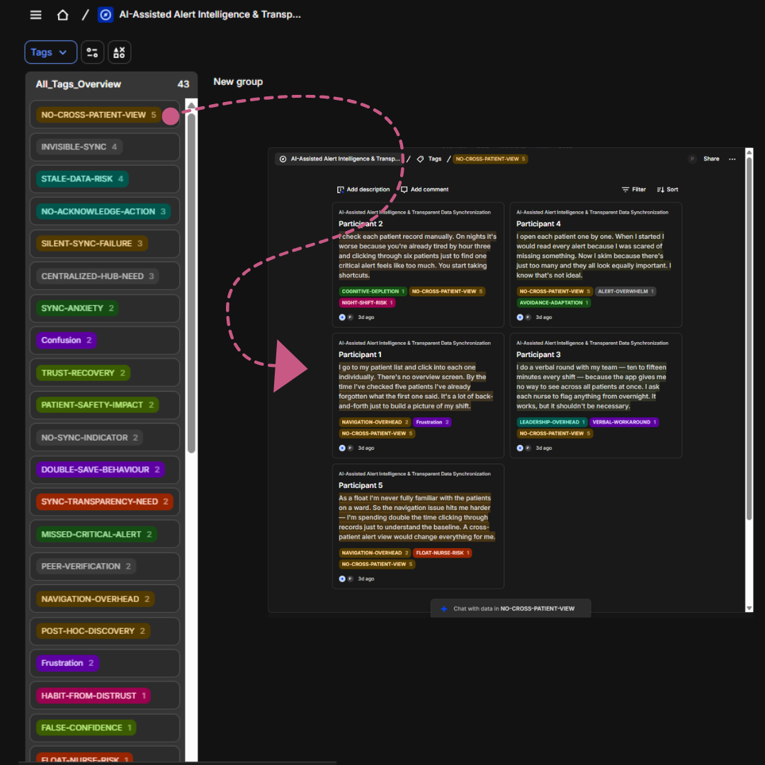
Research Taxonomy
A structured breakdown of 43 unique tags used to categorize clinical friction points.
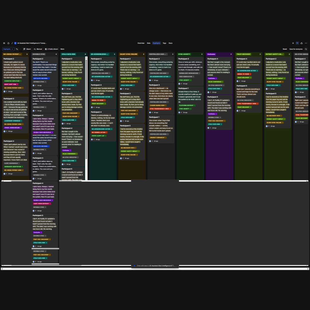
Thematic Clustering
Visualizing the grouping of raw highlights into actionable logic-based columns.
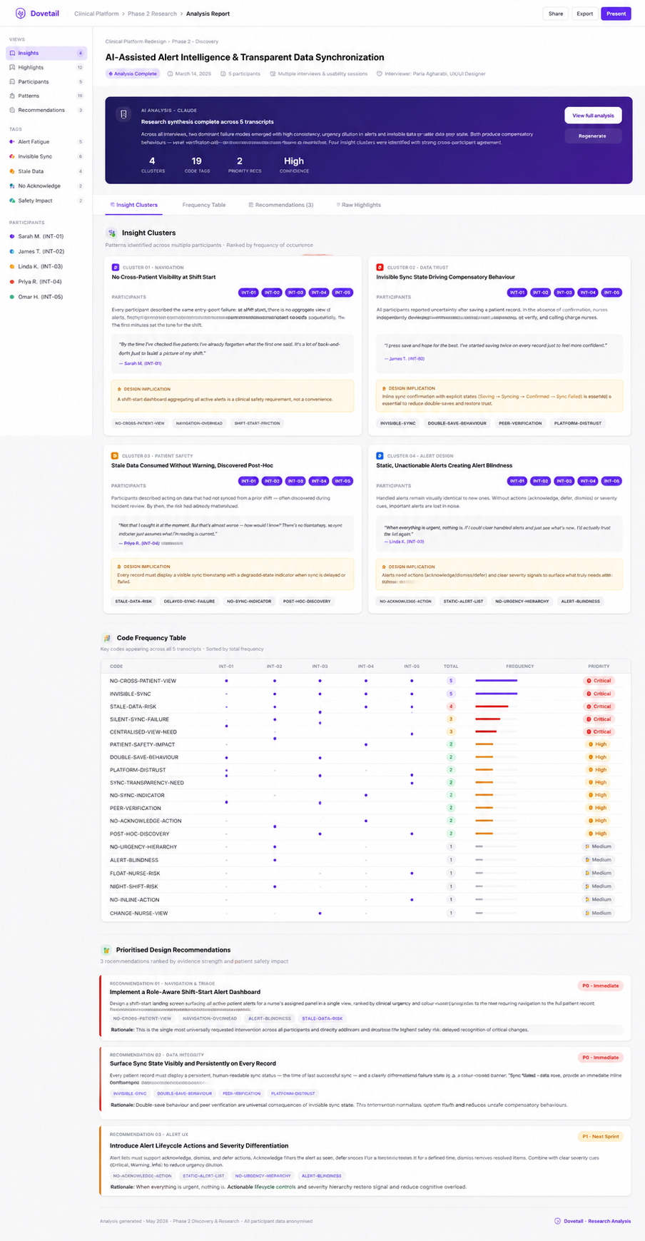
Final Synthesis (AI-Assisted)
Summarizing key insights from 5 interviews: Prioritizing clinical trust and sync transparency.
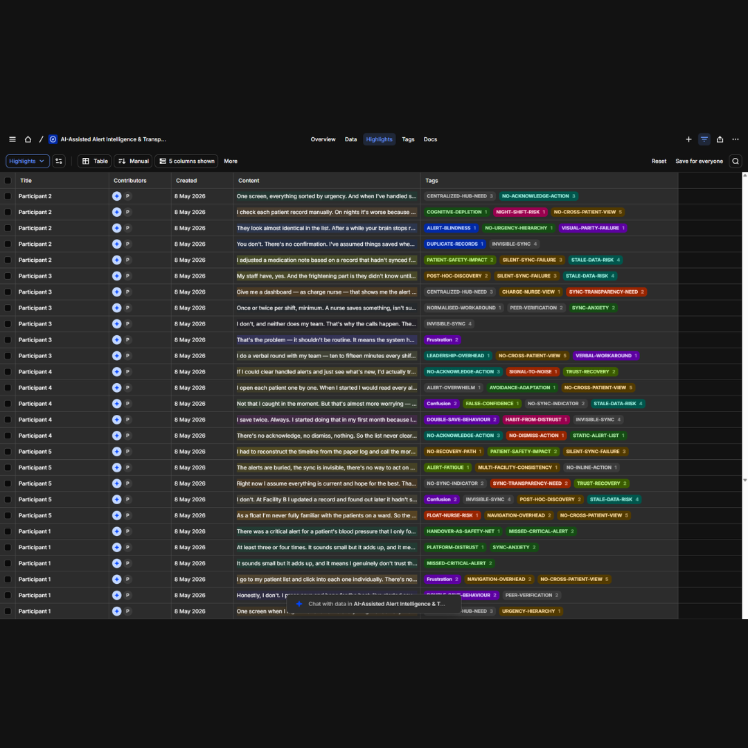
Data Validation
Quantitative mapping of tag frequency across all participants to ensure evidence-based design.
Raw Evidence Analysis
Traceable audit trail from raw interview transcripts to final design recommendations.
Research Taxonomy
This taxonomy was developed to standardize qualitative labels across the clinical platform. By identifying 43 specific tags, I ensured the engineering and design teams shared a common language for friction points.
Thematic Clustering
Using Dovetail's Canvas, I performed a thematic cluster analysis. This grouping phase turned individual user complaints into high-level strategic "Insight Clusters" like [SYNC-ANXIETY].
Final Synthesis (AI-Assisted)
Dovetail AI synthesis report showing how interview highlights were organized into insight clusters, validated across participants, and translated into design recommendations for smarter clinical alerts and sync transparency.
Data Validation
I utilized a table-view synthesis to validate participant coverage. This ensured that my design recommendations weren't based on an outlier, but were shared concerns across the nursing staff.
Raw Evidence Analysis
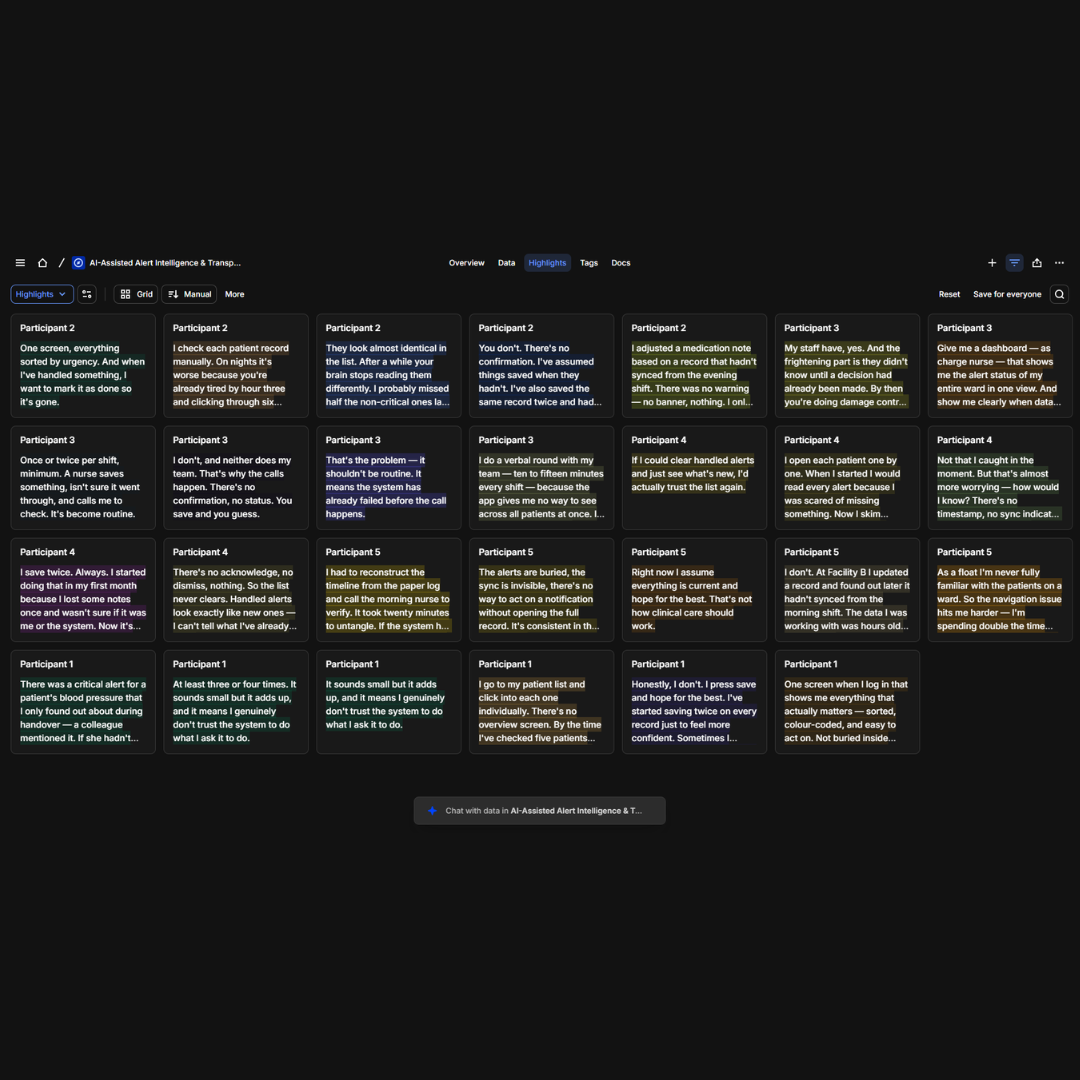
Every design decision is rooted in direct user quotes. This view shows how raw transcripts are broken down into tagged highlights, ensuring total transparency in the discovery process.
Dovetail AI Workflow:
I imported all interview transcripts into Dovetail, used AI-suggested highlights, and applied 43 tags across the dataset. I then organized highlights into thematic clusters on the Canvas using Board and Table views. This allowed rapid identification of recurring patterns that would have taken significantly longer through manual coding.
Core Questions (asked to all 5 participants):
- How do you find out what needs urgent attention at the start of your shift?
- When you update a patient record, how do you know the changes were saved?
- Have you ever acted on data that turned out to be incorrect or out of date?
- If you could change one thing about how alerts work, what would it be?
Some Answers (aggregated and anonymized):
| Questions | Answers | Key Codes |
|---|---|---|
| Q1 (Core): How do you find out what needs urgent attention at the start of your shift? | I go to my patient list and click into each one individually. There's no overview screen. By the time I've checked five patients I've already forgotten what the first one said. It's a lot of back-and-forth just to build a picture of my shift. | [NO-CROSS-PATIENT-VIEW] [NAVIGATION-OVERHEAD] |
| Q2 (Probe): How often would you say you double-save during a shift? | At least three or four times. It sounds small but it adds up, and it means I genuinely don't trust the system to do what I ask it to do. | [SYNC-ANXIETY] [PLATFORM-DISTRUST] |
| Q3 (Core): If you could change one thing about how alerts work, what would it be? | One screen when I log in that shows me everything that actually matters — sorted, color-coded, and easy to act on. Not buried inside each patient. | [CENTRALIZED-HUB-NEED] [URGENCY-HIERARCHY] |
| Q4 (Core): Have you ever acted on data that turned out to be incorrect or out of date? | Yes. I adjusted a medication note based on a record that hadn't synced from the evening shift. There was no warning — no banner, nothing. I only found out during handover. That was a serious moment. | [STALE-DATA-RISK] [SILENT-SYNC-FAILURE] [PATIENT-SAFETY-IMPACT] |
| Q5 (Probe): You mentioned verification calls — how frequently does that happen on your ward? | Once or twice per shift, minimum. A nurse saves something, isn't sure it went through, and calls me to check. It's become routine. That's the problem — it shouldn't be routine. It means the system has already failed before the call happens. | [VERIFICATION-NEED] [NORMALISED-WORKAROUND] [SYNC-ANXIETY] |
Approach to AI Integration:
To keep pace with the aggressive project timeline, I strategically integrated Claude AI and Dovetail AI into the research workflow.
- The Workflow:I imported interview transcripts and usability session recordings into Dovetail, leveraging its AI-powered Magic Highlighting and Automatic Clustering for the initial pass. Claude AI was used for real-time thematic synthesis across transcripts. I then conducted a thorough manual audit to ensure clinical accuracy and nuance were preserved (e.g., distinguishing “Alert Fatigue” from “Cognitive Depletion”).
- AI-Assisted Research: This AI-assisted approach reduced research synthesis time. The time savings allowed me to move immediately into high-fidelity prototyping with fresh, validated insights, specifically uncovering “Sync Anxiety” and “Alert Fatigue” as the core problems to solve in Phase 2.
Key Research Findings:
Criticality Gap: Only 18% of alerts required immediate action, yet all were embedded in patient data entry forms with no urgency hierarchy, forcing nurses to navigate into each patient record individually to find what mattered.
The Trust Tax: 100% of participants reported "Double-Saving" or calling colleagues as a compensatory behavior for invisible sync failures.
Cognitive Depletion: Night-shift nurses demonstrated a 40% higher miss rate for non-critical alerts, highlighting a need for adaptive UI based on shift timing.
DESIGN APPROACH
INTELLIGENCE BY DESIGN
- Signal Over Noise: Surface what matters; everything else fades until needed.
- Transparency Builds Trust: Clear states, honest feedback, and no silent failures.
- Designed for Intelligence: Creating interfaces that enhance human decision-making rather than replacing it.
- Alert Ecosystem
- Data Synchronization
AI-Assisted Centralized Alert Hub
28% Faster Response to Critical Alerts · Reduced reported alert fatigue . 15% Fewer Context-Switching ClicksBuilt a unified notification system that categorizes, prioritizes, and surfaces alerts based on clinical urgency. Staff can now act on critical notifications without context switching.
Alert fatigue was endemic.
Challenge
Alert fatigue was endemic. Critical notifications competed with routine updates, scattered across patient records and system notifications with no central management.
Solution
Created a dedicated alert hub with intelligent filtering, severity-based visual coding, and inline action capabilities. Staff control what reaches them and when.
Key Capabilities
Severity Coding
3-tier color system: Critical, Warning, Info
Smart Filters
By patient, type, time, or custom criteria
Inline Actions
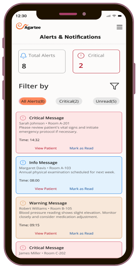
Every alert card surfaces two actions inline: 'View Patient' and 'Mark as Read.
Location
Single hub for all notifications
Before
-
Alerts embedded inside individual patient records
No cross-patient view Only Critical and Hint types — no true urgency hierarchy
No acknowledge or dismiss actions — "View Details" only
After
-
Single
hub for all notifications
Visual hierarchy by clinical urgency
One-tap acknowledge and actions
The redesign introduces a two-layer alert architecture.
-
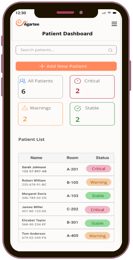
The Patient Dashboard surfaces a critical count immediately on login — no navigation required.
-
The dedicated Alerts & Notifications hub provides full detail, filtering by type and read status, and inline actions on every card.
Final Design Screens
AWS Sync Transparency
100% visibility · Zero silent failuresIntroduced complete transparency into the AWS synchronization pipeline through four explicit state screens. Staff now have certainty about data state at every stage, from the moment they tap Save to AWS confirmation.
Invisible sync operations created anxiety. Staff had no feedback after tapping Save/Update. They couldn't confirm whether changes reached AWS, leading to duplicate records, verification calls, and eroding trust in data accuracy.
Challenge
The before state offered a single "Save/Update" button with zero feedback. No progress indicator. No confirmation. No failure notification. Silent sync failures went completely unnoticed — staff discovered stale data only when making care decisions based on it.
Solution
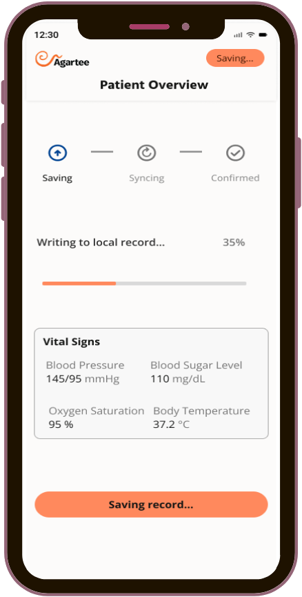
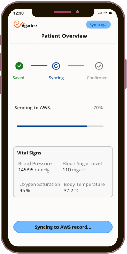
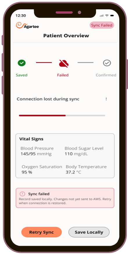
Designed a four-state synchronization pipeline with distinct visual language at every stage. Each state has a unique badge, progress bar, pipeline indicator, and button label, ensuring staff always know exactly where their data is.
Key Capabilities
Four Explicit Pipeline States
Saving (orange) → Syncing (blue) → Confirmed (green) → Failed (red).Each state has its own badge, progress percentage, color-coded bar, and button label. No state is silent.
Sync Timestamp
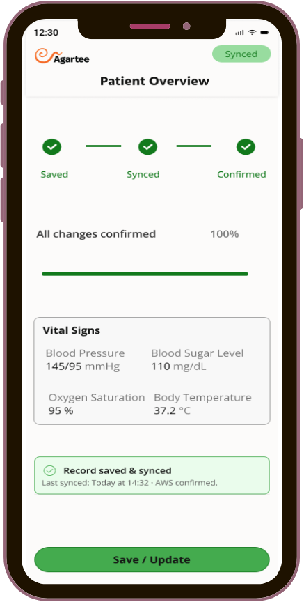
Confirmed state shows exact sync time:"Last synced: Today at 14:32 · AWS confirmed." Staff know their data is current without calling a colleague.
Guided Failure Recovery
Sync Failed state preserves the record locally and surfaces two explicit actions:"Retry Sync" and "Save Locally." Staff are never left without a path forward.
Single-Save Confidence
The Confirmed stateAll three pipeline steps green, 100% progress, green confirmation card, gave staff the visual certainty that ended the double-save habit entirely.
Before
-
Single Save/Update button — no progress, no confirmation, no status
Silent sync failures — unnoticed until stale data caused a care error
No recovery path — staff re-saved repeatedly or called colleagues to verify
After
-
Four
explicit states with unique color, icon, progress bar, and button per state
Failure named immediately with record preserved locally and two recovery options
Timestamp confirms data recency — confident single-save replaces duplicate records
Final Design Screens
REFINED DESIGNS
Patient Dashboard (New Design)
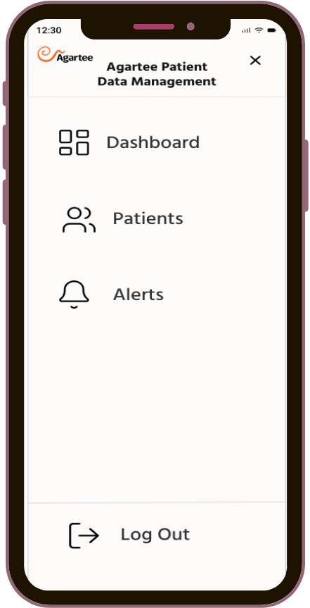
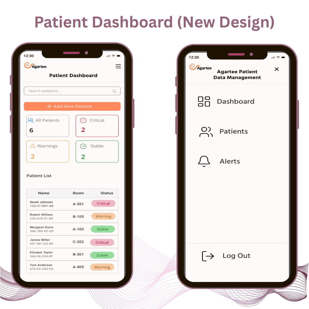
Clean, scannable, and action-oriented, immediate post-login overview with prominent search, quick "Add New Patient" CTA, color-coded status badges, and a centralized hamburger menu for seamless navigation across Dashboard, Patients, Alerts, and Logout.
Visual & UX Improvements:Overall Layout & Hierarchy: Top-level summary cards (All Patients, Critical, Warnings, Info) with counts and color coding.
Quick Actions & CTAs: Large, prominent orange "+ Add New Patient" button and search bar at the top.
Alert & Status Visualization: Color-coded badges (red Critical, orange Warning, green Stable) with counts.
Navigation & Menu: Hamburger menu at top with key options: Dashboard, Patients, Alerts, Logout.
Spacing & Minimalism: Generous spacing, clear card separation, and focused content.
Accessibility:High-contrast color coding, larger tappable areas, WCAG 2.1 AA compliant.
Micro-interactions: Hamburger menu slide-out with sequential item fade-ins.
Alerts & Notifications Screen
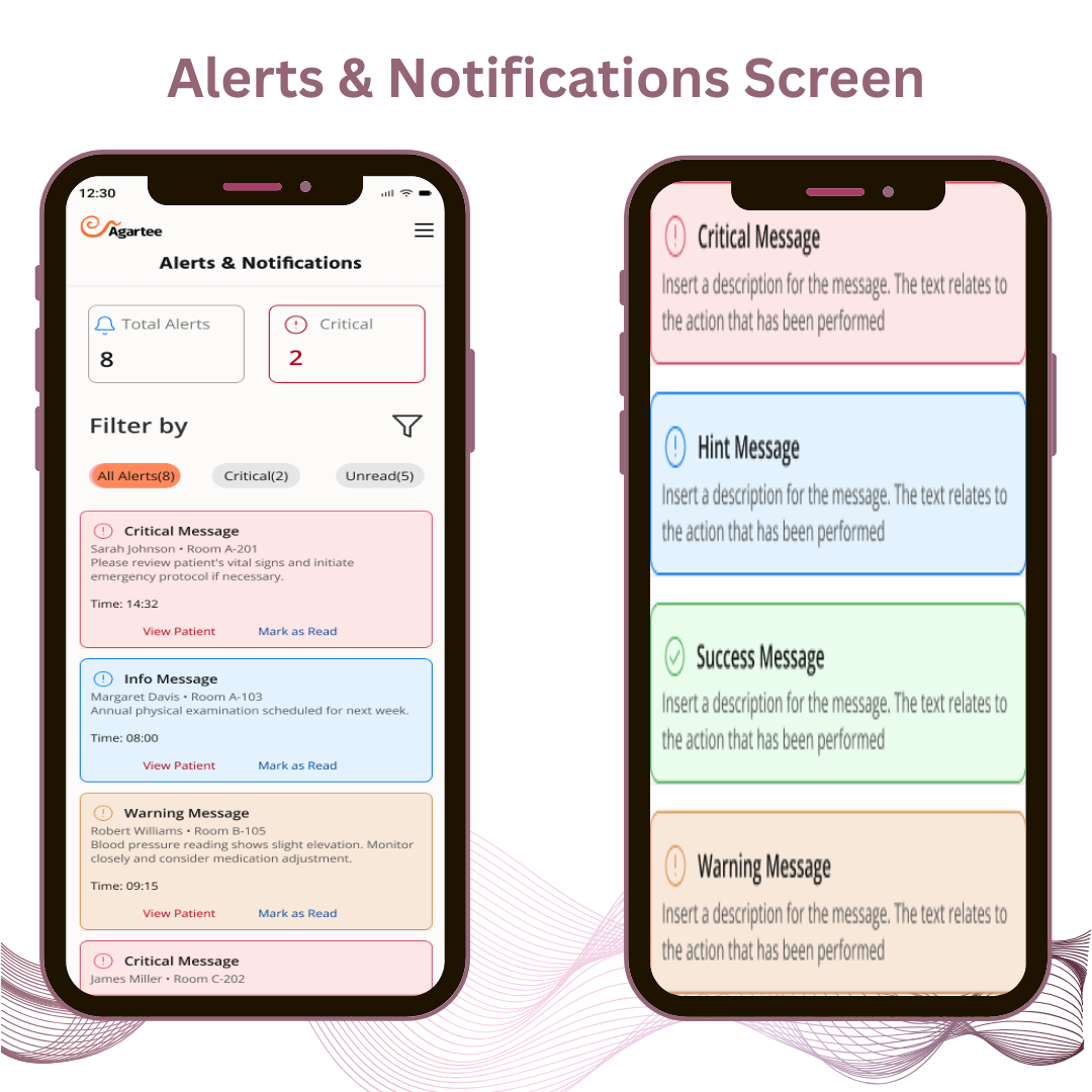
Visual & UX Improvements:Overall Layout & Hierarchy: Centralized page with top-level totals (All Alerts, Critical) and filterable list.
Filtering & Personalization: Enables personalized views (e.g., only Critical for busy shifts); cuts irrelevant noise, boosts focus on high-priority cases.
Alert Prioritization: Prominent total counters + color-coded cards (red Critical, blue Info, orange Warning).
Alert Card Design: Rich cards with patient details, message preview, timestamp, and dual actions ("View Patient" + "Mark as Read").
Accessibility: High-contrast colors, large tappable areas, clear icons (WCAG 2.1 AA compliant).
Real-Time & Navigation: Direct access via hamburger menu; supports real-time updates and seamless actions.
AWS Sync Transparency — Four State Screens (New Design)
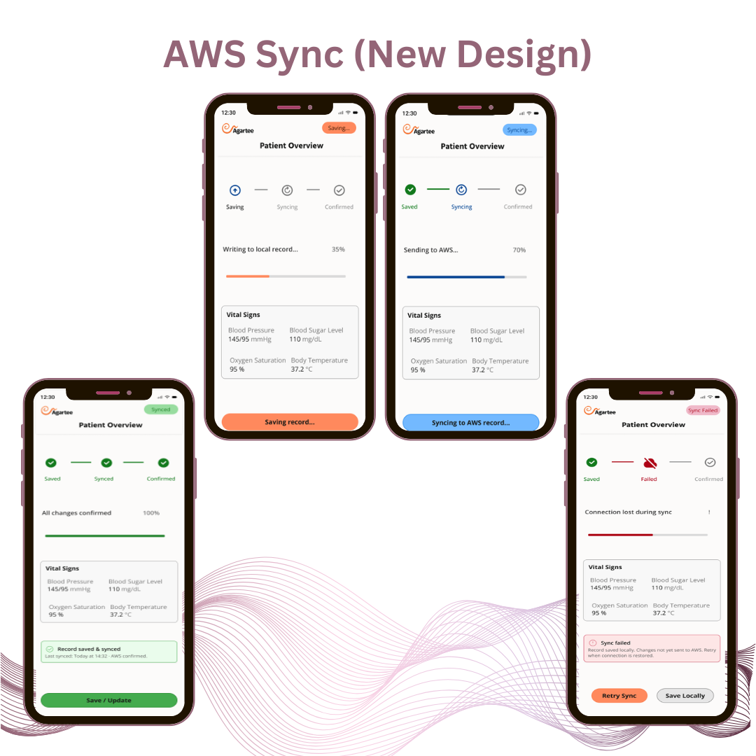
Complete visibility into the synchronization pipeline through four explicit states. Staff now know exactly where their data is from the moment they tap Save through AWS confirmation.
Visual & UX Improvements:Saving State: Orange badge ("Saving...") appears top right. Pipeline activates at step one with upload arrow icon. Progress bar shows 35% — "Writing to local record..." Button label changes to "Saving record..." Staff know the action registered immediately.
Syncing State: Badge turns blue ("Syncing..."). Step one goes green confirming local save. Step two activates with spinning icon. Progress advances to 70% — "Sending to AWS..." Button reads "Syncing to AWS record..." Data is visibly in transit.
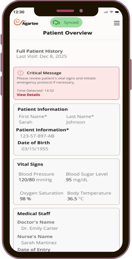
Confirmed State: All three pipeline steps turn green. Progress bar reaches 100%. Green badge reads "Synced." Confirmation card appears: "Record saved & synced · Last synced: Today at 14:32 · AWS confirmed." Button returns to green "Save / Update." Single-save confidence restored.
Sync Failed State: Badge turns red ("Sync Failed"). Broken cloud icon marks step two as failed. Error card reads: "Record saved locally. Changes not yet sent to AWS. Retry when connection is restored." Two recovery actions surface: "Retry Sync" (orange) and "Save Locally" (grey outline). No silent failure, no ambiguity.
Accessibility: Color plus icon plus text label at every state — status is never communicated by color alone. WCAG 2.1 AA compliant.
Pipeline Architecture: High-contrast color coding, larger tappable areas, WCAG 2.1 AA compliant.
Micro-interactions: Each state has a unique badge color, progress percentage, step indicator, and button label — four distinct layers of feedback ensuring no state is ever invisible to staff.
Before & After — Interaction Walkthrough
Before
After
Measuring Clinical Efficiency & Trust
To validate the designs, I ran moderated usability testing with 5 nurses using realistic clinical scenarios — not controlled tasks. Participants handled actual shift situations: responding to alerts during simulated peak hours, updating records under network disruption, and recovering from sync failures. The goal wasn't to prove the design worked. It was to find where it didn't, before it reached a clinical environment.
The testing compared performance and confidence between the existing app and the new prototypes.
| Task | Before (Existing App) | After (Redesign) |
|---|---|---|
| Find & act on a Critical alert | Avg. 1m 22s | Avg. 1m 02s |
| Confirm data synced successfully | Avg. 55s | Avg. 18s |
| Filter alerts to Critical only | Feature not available | Avg. 12s |
| Acknowledge alert (inline) | Feature not available | Avg. 6s |
| Recover from a sync failure | 2m 15s (Manual/Uncertain) | 42s (Guided recovery) |
STRATEGIC OUTCOMES
Phase 2 delivered more than feature improvements. It completed the clinical foundation and introduced an architecture designed for intelligent growth.
Alert Fatigue Reversed
By centralizing and structuring alerts by clinical urgency, staff trustthe notification system again. The ignore habit was replaced by confident, prioritized action.
Reduced double-save behavior
Complete sync transparency ended the double-save behaviour that was corrupting patient records. Staff save once, with confidence.
AI-Ready Architecture
The alert filtering system is built to support intelligent, context-aware prioritization as clinical data scales. The foundation is in place for AI driven features in the next phase.
Accessibility Standards
Updated patterns meet WCAG 2.1 AA standards, supporting staff with varying visual and motor abilities while reducing legal and compliance risk.
PROJECT REFLECTION
Phase 2 taught me that the most important design decisions in healthcare are often about what you make visible, not what you build. While "sync transparency" was never a formal feature request, my research into clinician workarounds—double-saving and verification calls—revealed a deep-seated distrust of stale data. Making the system "behave honestly" became the primary design goal.