Agartee Technology Inc. Patient Data Management App

Project information
- TEAMProduct Manager, Backend & Frontend Engineers, UX/UI Designer (me!)
- TIMELINEJuly - October 2024 - ~16 weeks
- KEY SKILLSUX Research, Prototyping, Usability Testing, Iterative Design
- PARTNERSHIPSNursing home facilities
- TOOLSFigma, Notion, Canva, Lucidchart

Project Overview
As part of a modernization initiative, AGARTEE set out to improve how nursing home staff manage patient health information; replacing fragmented legacy tools with a single, accessible,and real-time platform.
I began the project by conducting a survey with nursing staff, but the findings were contradictory and incomplete, making it risky to define requirements.
My mission: My role was to unravel the complexity, uncover the true workflows, and translate them into a cohesive design system and user-friendly app.
Problem Statement
Healthcare staff in nursing homes faced delays and errors due to outdated, fragmented, and paper-based systems for managing patient data. These issues, combined with glove use, limited technology familiarity, and high-pressure environments, made accurate, real-time documentation difficult. We needed to deliver a secure, intuitive app to streamline data entry, improve team coordination, and enhance patient safety.
My Role
As the UX/UI designer, I was responsible for the entire design process from discovery to delivery. My responsibilities included
- Research refinement from messy initial findings.
- Creating wireframes, prototypes, and a design system from scratch.
- Facilitating usability testing and iterating based on feedback.
- Built the AGARTEE Design System using atomic design principles.
- Ensured WCAG-compliant accessibility and AWS Cloud-based secure architecture.
VALUE DELIVERED
Identified and resolved critical workflow contradictions through field research & observation.
Streamlined data entry reduced a multi‑system documentation process to three core screens, validated to cut completion time by 36%.
Achieved 32% fewer entry errors with consistent units, labels, and inline validation.
Raised accessibility audit scores by adhering to WCAG 2.1 AA standards, implementing large 48px touch targets, high-contrast color themes, auditory cues to confirm successful touches, and robust ARIA labels for improved screen reader support.
Established scalable, token-based design standards cutting design time by 35%.
1. The Opportunity:
- I was tasked to design a brand-new Patient Data Management application for a network of nursing homes, starting from scratch. This was a pivotal challenge: to deliver a secure, intuitive tool that could unify and modernize how staff accessed, recorded, and shared patient health information.
2. The Reality of a "Blank Slate":
- Initially, working without legacy constraints seemed liberating—a chance to shape every part of the experience. But with no existing digital system, every decision—navigation, interface logic, accessibility—could make or break daily care routines and patient safety outcomes.
3. Uncovering True Complexity:
- While the ask appeared to be a digital solution to replace scattered paper records and outdated EHRs, it quickly became a much deeper challenge. Early survey-based research was inconsistent, making user needs unclear. There was also significant pressure to deliver an MVP within 16 weeks, without a design system, UX direction, or clarity on workflows.
THE PROBLEM
THE STARTING POINT
A Wall of Contradictions — When Data Says Everything and Nothing
When I joined Agartee Technology Inc., there was no existing product; only an urgent mandate to build a Patient Data Management App from scratch for healthcare providers in nursing homes.
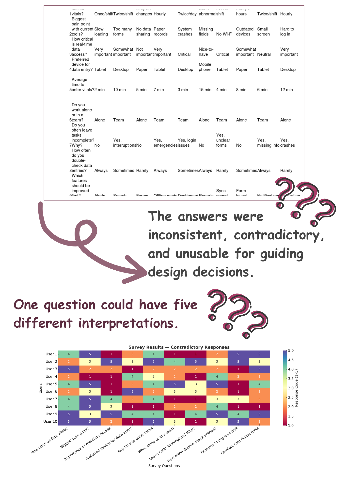
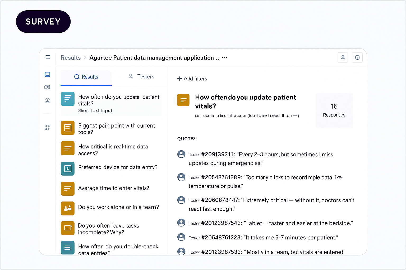
To ground the project, I launched an initial nurse survey with 10 targeted questions. On paper, this “research” looked like a starting point, until I dug in.
The answers were inconsistent, contradictory, and unusable for guiding design decisions. One question could have five different interpretations. The team expected me to start designing from these fragments, but I knew the real insights were still hidden.
USER SEGMENTATION
-
Primary Users:
Nurses: Frequent, high‑pressure data logging at point of care.
Doctors: Review aggregated records for clinical decisions.
Primary users responsible for direct patient care. Their needs centered on ease of use, real-time data access, and seamless integration with existing workflows.
-
Secondary Users:
Facility Administrators and Support Staff (dietitians, kitchen): Support roles that require access to patient data for care coordination.
CONFIRMING THE SCOPE
The first thing I did was try to confirm the details.
But the more I read, the less clear it became:
- Frequency of updates? Some did it hourly, others only when changes occurred.
- Criticality of real-time access? Ranged from “essential” to “nice-to-have.”
- Preferred device? Everything from paper to tablets to desktops.
I transformed the raw survey into a color-coded matrix to visualize contradictions. This heatmap made it immediately clear we could not base design solely on these surveys.
DISCOVERY
UNCOVERING THE FULL PICTURE!
So what’s the actual process? Since the survey wasn’t giving a clear answer, I:
- Transformed the raw responses into a color-coded heatmap matrix, the contradictions popped instantly.
- Mapped workflows via user journey diagrams.
- Identified error-prone data entry across platforms.
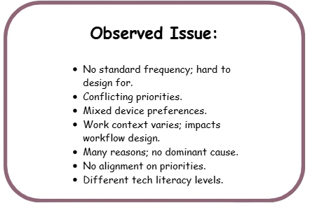
These insights revealed that multiple redundant steps, tool-switching, and unclear accountability made it immediately clear that we could not base the design solely on these surveys.
GATHERING MORE CLUES
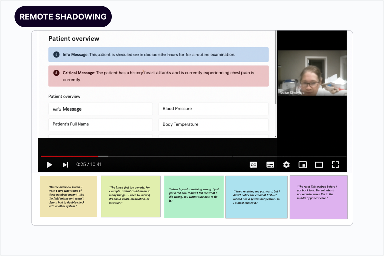
Since the survey wasn’t giving a clear answer, I replaced the unusable survey with on-site observational studies, usable survayand using Maze,and structured interviews.
- Observed and shadowed end users in their environment.
- Conducted usable survey to define end users pain points.
- Interviewed admins about compliance documentation pain points.
- Interviewed stakeholder emphasized the importance of real-time data accuracy and accessibility, and also underscored the desire for features powered by AI.
- Worked with the dev team to understand system limitations.
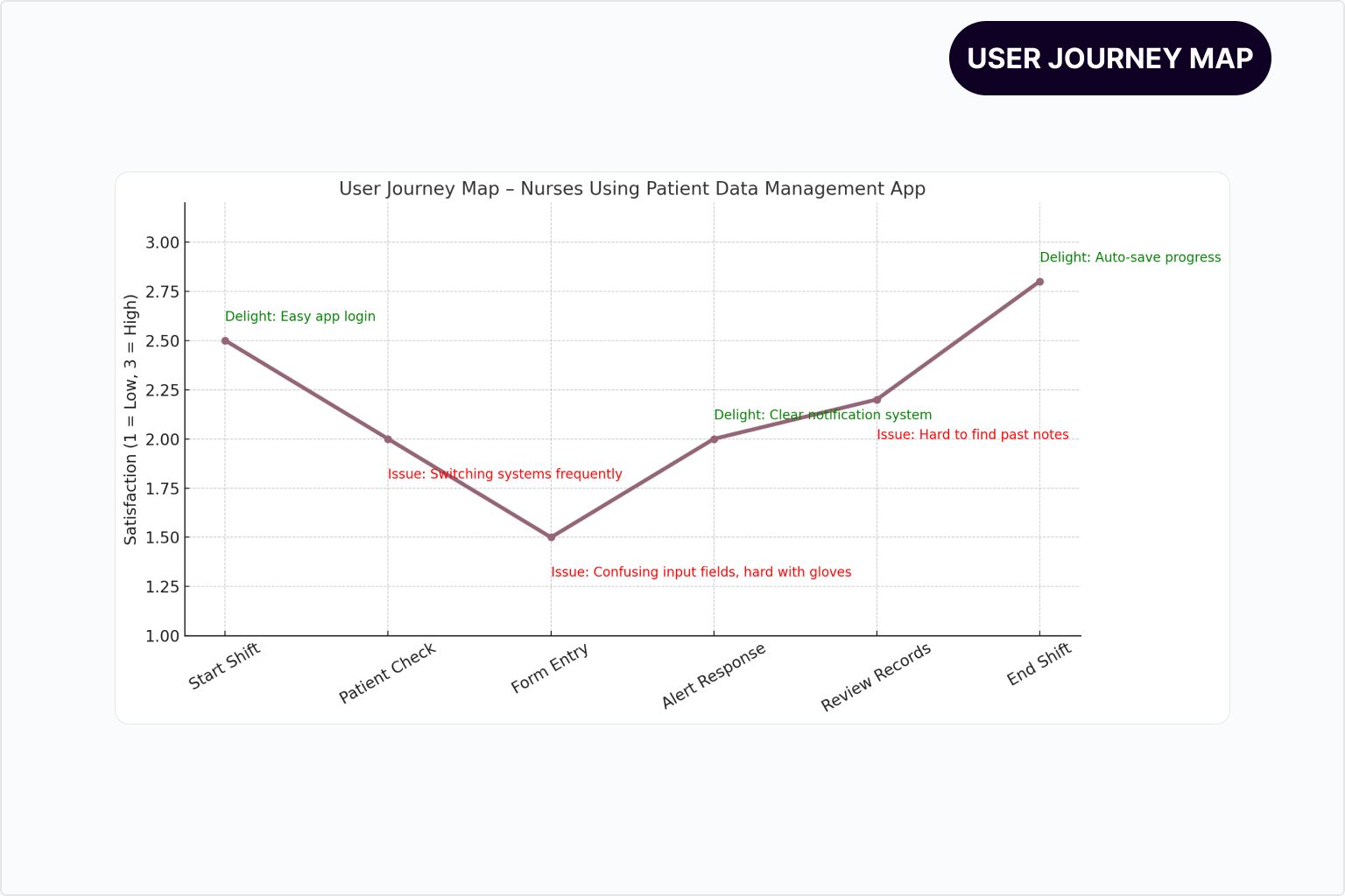
OBSERVATION AND SHADOWING NOTES
Nursing homes staff
- Nurses need to efficiently record and review patient vital signs, and receive immediate, high-priority alerts for critical changes so they can deliver timely and accurate patient care.
- Interruptions are constant for nurses in a 2-hour window, the average nurse was interrupted 3-5 times, forcing them to abandon half-completed entries.
- Work zones are dynamic vitals are taken bedside, in hallways, and sometimes in storage areas due to urgency.
- Doctors relied on verbal updates or ad-hoc messaging if data was missing.
- Doctors require instant access to real-time patient data, with automated flagging of abnormal vital signs so they can identify urgent cases efficiently.
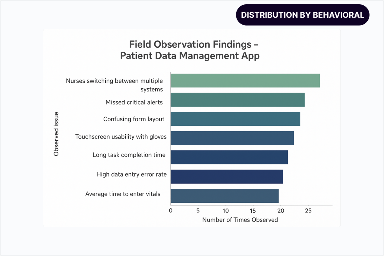
USER PAIN POINTS
SCOPE REFINEMENT
These activities were critical in accurately defining the project scope: not simply digitizing existing patient records, but designing a unified, intuitive platform that enables real-time data collaboration, minimizes errors, and integrates seamlessly within the highly regulated and fast-paced healthcare environments.
A major focus of the Patient Data Management app was designing features that balance the real-world needs of frontline users with the strategic goals of the organization. The Venn diagram below illustrates this crucial overlap, demonstrating how thoughtful design delivers value on both sides.
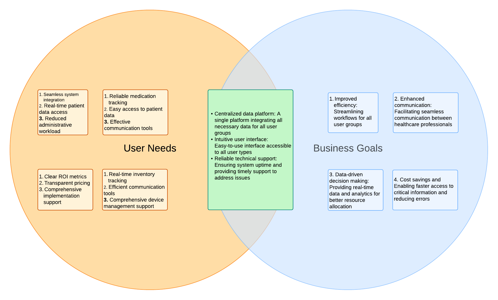
This alignment of user-centered design with strategic business goals underpins the success of the Patient Data Management app, delivering tangible value to both caregivers on the front lines and nursing home leadership.
DESIGNING FLOWS THAT WORK FOR EVERY USER ROLE
Once the core scope was defined, I moved into structuring the product’s information architecture. My goal was to give each role (nurse, doctor, admin) a clear path to the right information with minimal clicks and no unnecessary cognitive load.
WHAT I DELIEVERD FIRST
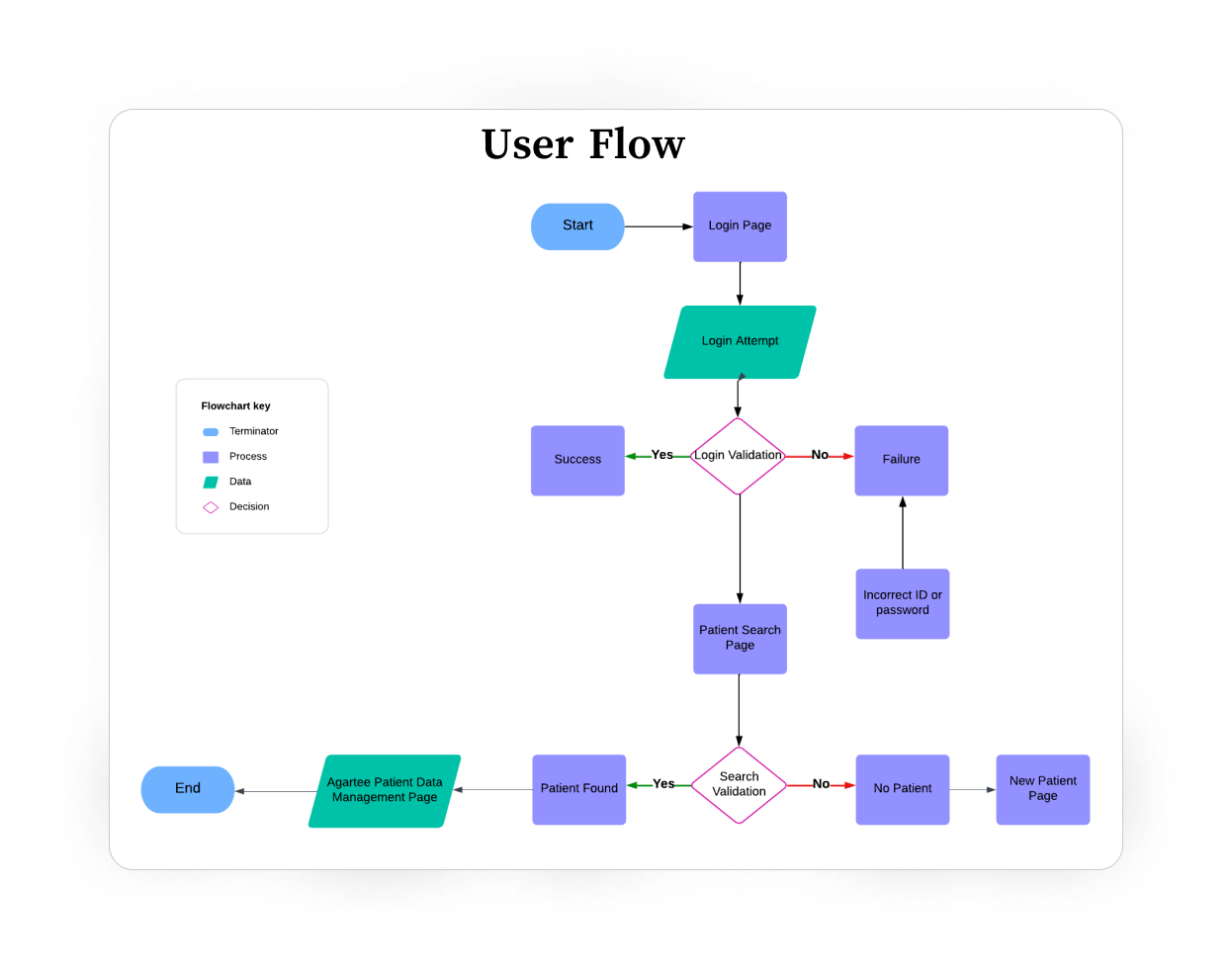
- User Flow: mapped out step-by-step journeys for the top 3 critical tasks (logging vitals, reviewing patient status, exporting compliance reports).
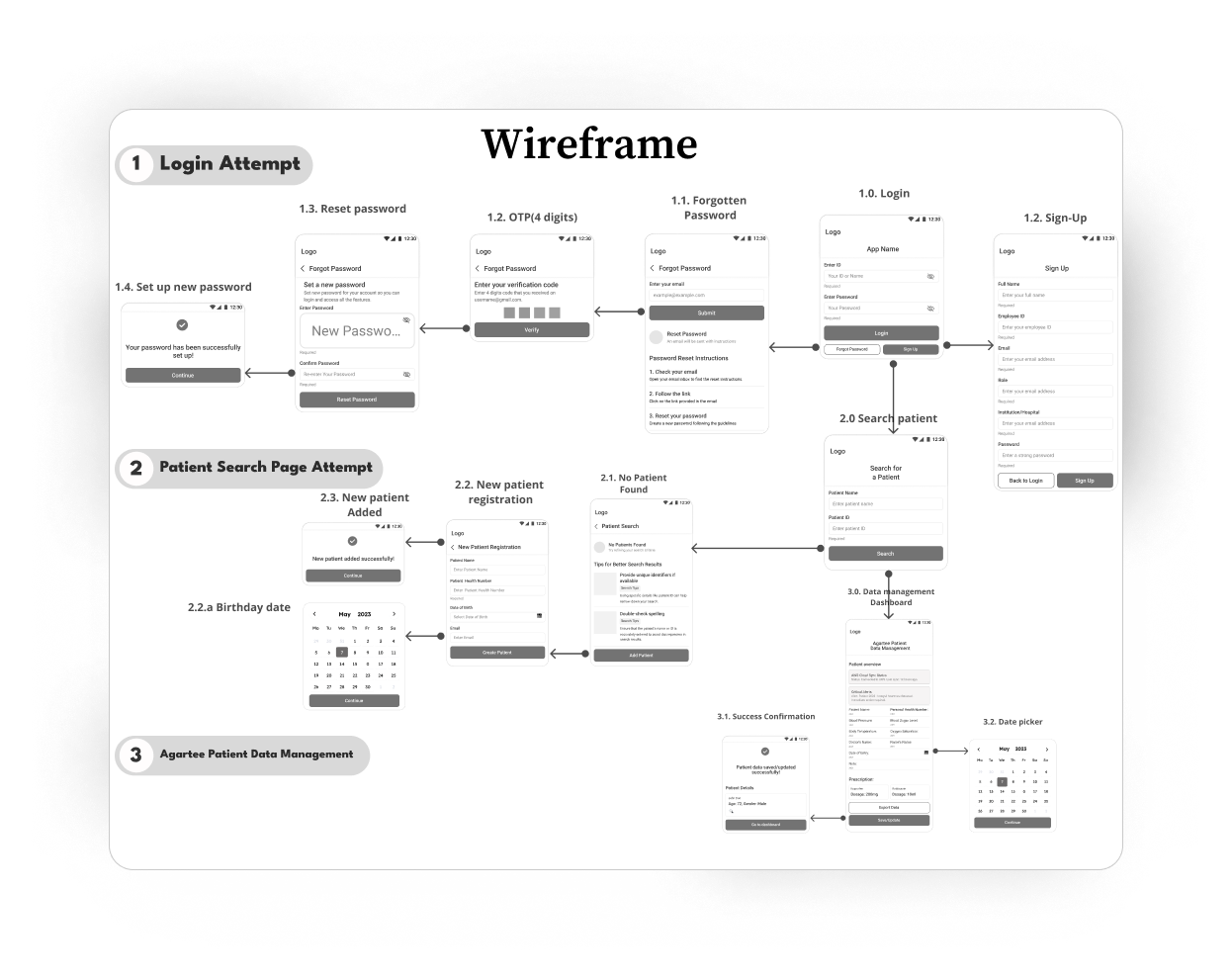
- Wireframe: low-fidelity layouts to define content hierarchy and navigation.
- Interactive Prototype (Figma): click-through prototype simulating the entire workflow for remote testing.
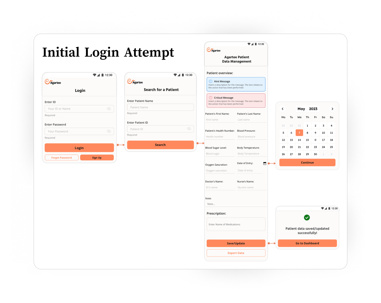
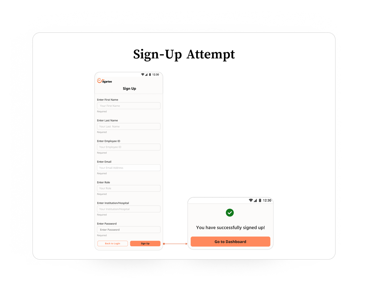
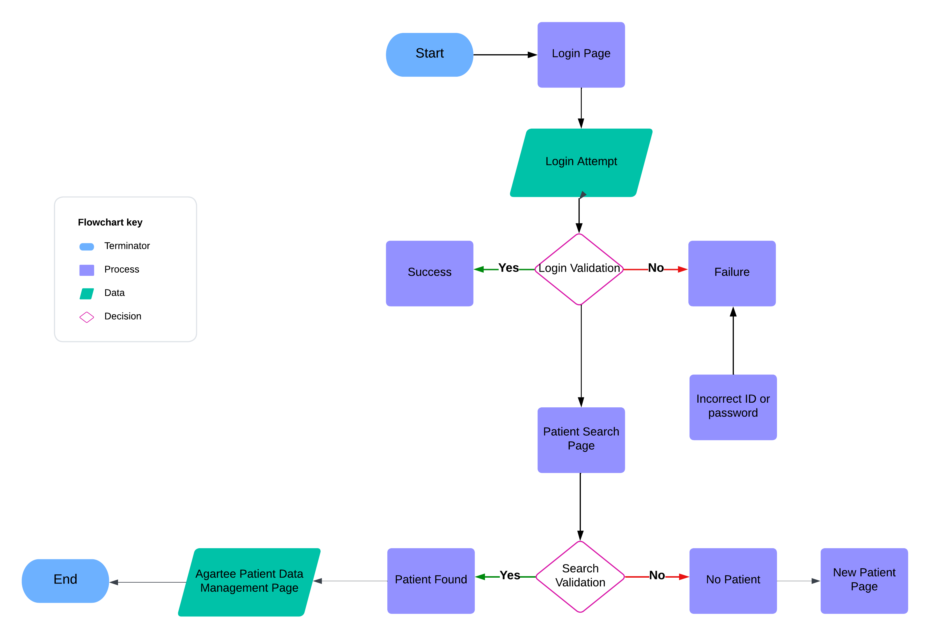
USER FLOW
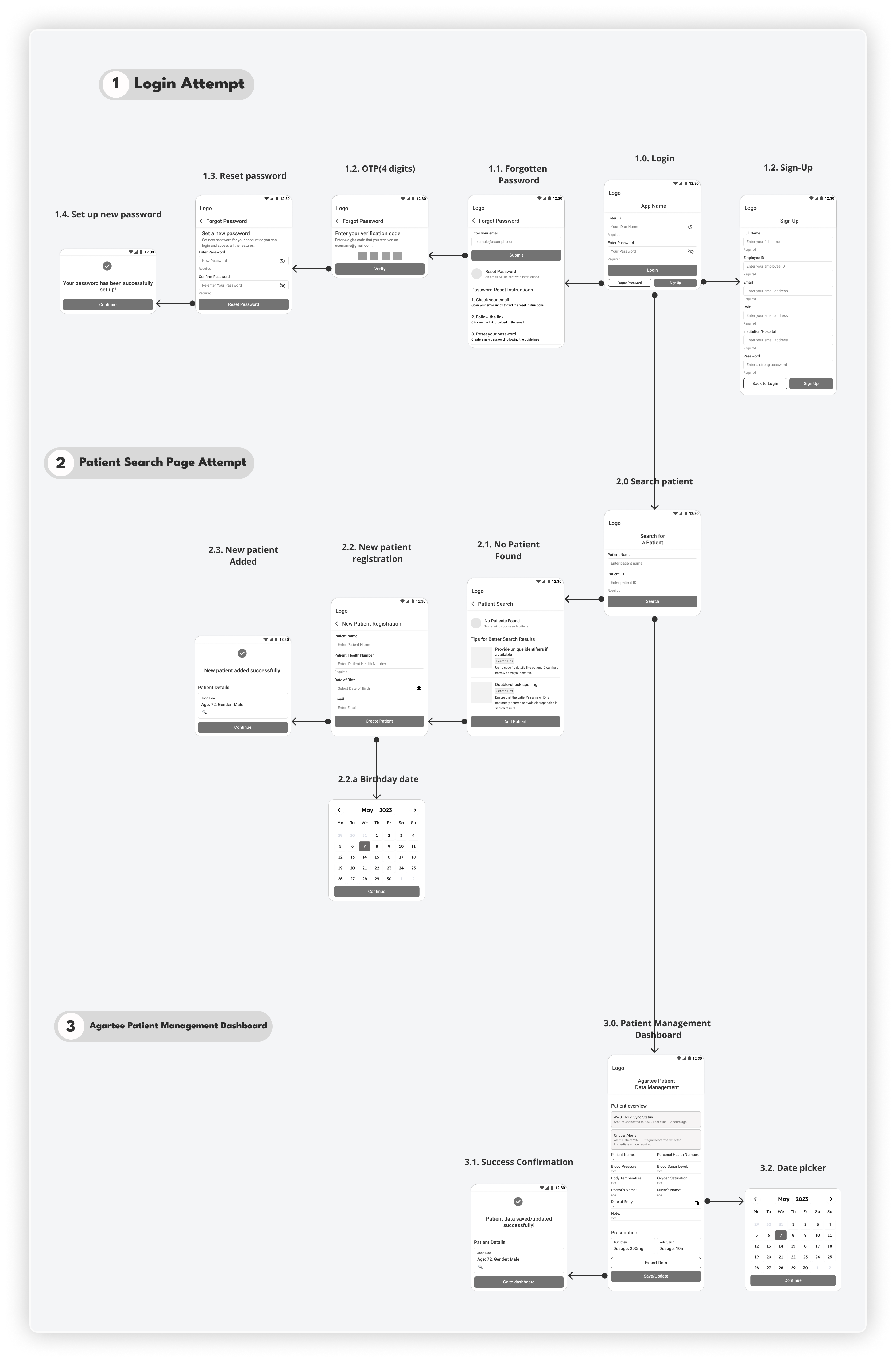
LOW-FI WIREFRAME
WIREFRAMES: CONNECTING THE DOTS
With team alignment and requirements refined, I mapped out the core user journey. In Figma, I designed a first round of lo-fi wireframes to address our most critical workflows, structured across three main sections:
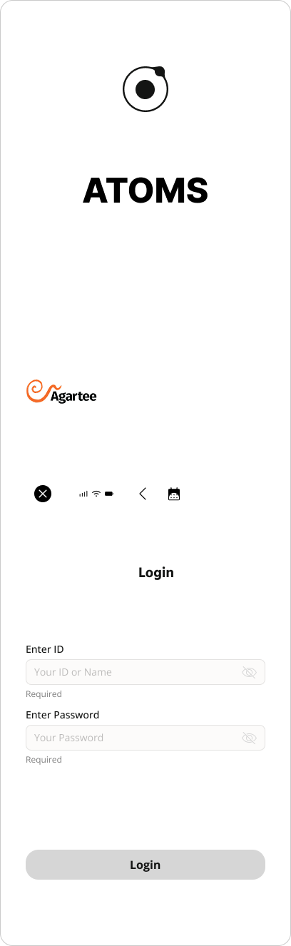
- Login & Account Creation: Streamlined login and account setup screens to minimize failed attempts and simplify onboarding for staff with varying tech skills.
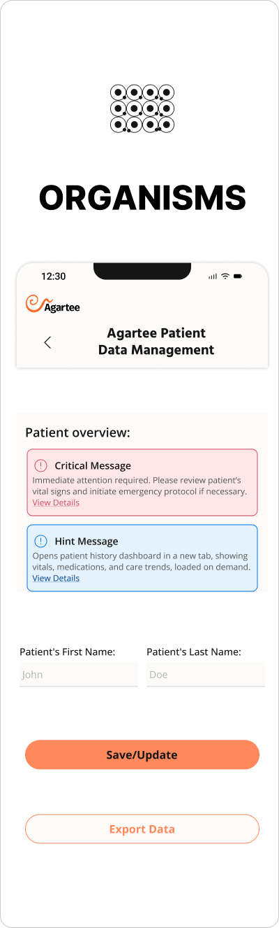
- Patient Search: Designed an intuitive patient lookup interface, enabling rapid search, fast selection, and clear error messaging for unsuccessful searches.
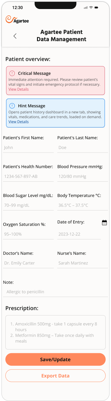
- Agartee Patient Management Dashboard: Centraled hub for entering patient data, managing alerts, and tracking clinical updates.
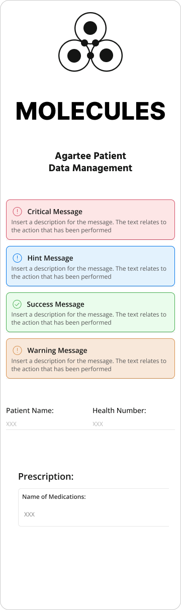
ATOMIC DESIGN METHODOLOGY
ATOMIC DESIGN BREAKS DOWN:
- Atoms: The foundational UI elements, such as buttons, input fields, labels, and icons. Each atom is designed to be simple and reusable.
- Molecules: Groups of atoms combined to create more functional components, like a labeled input field or a search bar with an icon.
- Organisms: Complex, reusable sections of the interface, such as navigation bars, patient overview cards, or multistep forms. Organisms are assembled from various molecules and atoms.
- Templates: Page-level layouts that define content structure and user flow but remain flexible for real data.
- Pages The finished screens that users interact with, populated by templates and organisms and tailored to specific use cases.
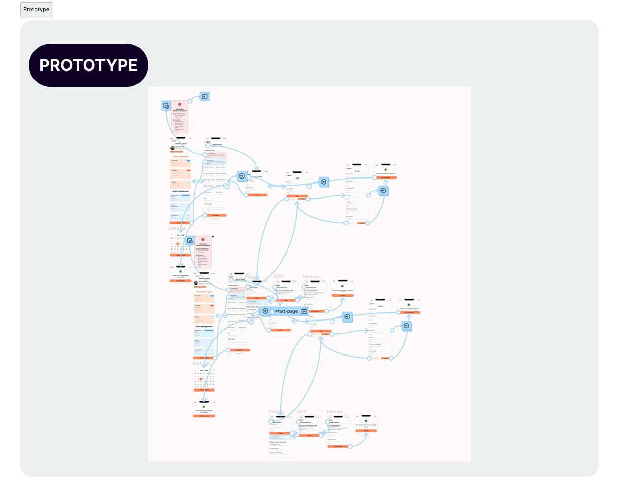
INTERCATIVE PROTOTYPE - FIRST VERSION


PROTOTYPE: FIRST VERSION
Once foundational wireframes were validated with stakeholders and mapped to real clinical workflows, I developed an interactive Figma prototype simulating the entire nurse experience:
- Login and account creation.
- Patient search and selection.
- Patient management dashboard with data entry forms.
HOW I VALIDATED IT
Alongside remote unmoderated shadowing, follow-up sessions ,and close collaboration with the PM, development team, and stakeholders, I conducted task-based usability tests with actual users to rigorously evaluate key design decisions.
WHAT THE TASK-BASED USABILITY TEST INVOLVED
Designed realistic, scenario-driven tasks reflecting primary user goals, such as:
- Entering patient vital signs accurately.
- Recovering a forgotten password.
- Reviewing patient history via the overview dashboard.
Recruited representative users (nurses, doctors, admins) reflecting the app’s diverse technical literacy and contextual constraints.
Observed users completing tasks in a controlled, remote setting with screen recording and think-aloud protocols.
Captured quantitative metrics such as:
- Task completion time.
- Error rates (e.g., incorrect data entry).
- User satisfaction ratings.
Collected qualitative feedback through post-task interviews and surveys.
WHAT USABILITY TESTING REVEALED
Designed realistic, scenario-driven tasks reflecting primary user goals, such as:
- Unit measurements missing or unclear.
- Labels not descriptive enough.
- Lack of actionable error messages.
Confusion in Patient Overview Form
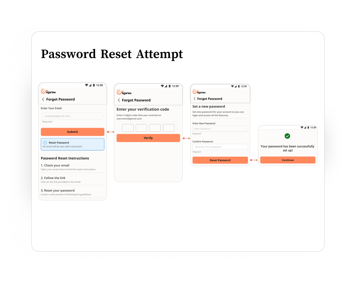
“Forgot Password” Process Barriers
- Users did not recognize the reset email.
- Reset links expired too quickly (10 minutes).
- Confusion between a reset before login vs. change after login.
Stakeholder Field Expansion Requests
- Desire for more detailed patient data for future AI-powered analytics.
- Risk of overwhelming staff with non-critical fields.
Dashboard Performance Bottleneck
- Initial design loaded all data at once (vitals, meds, long-term trends).
- Dev team flagged this as a cause for slow load times during tests.
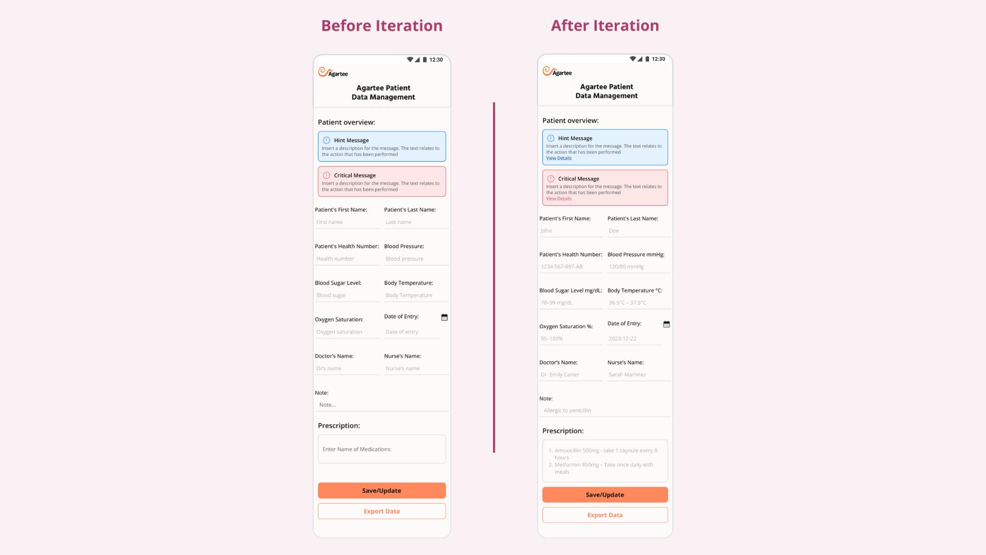
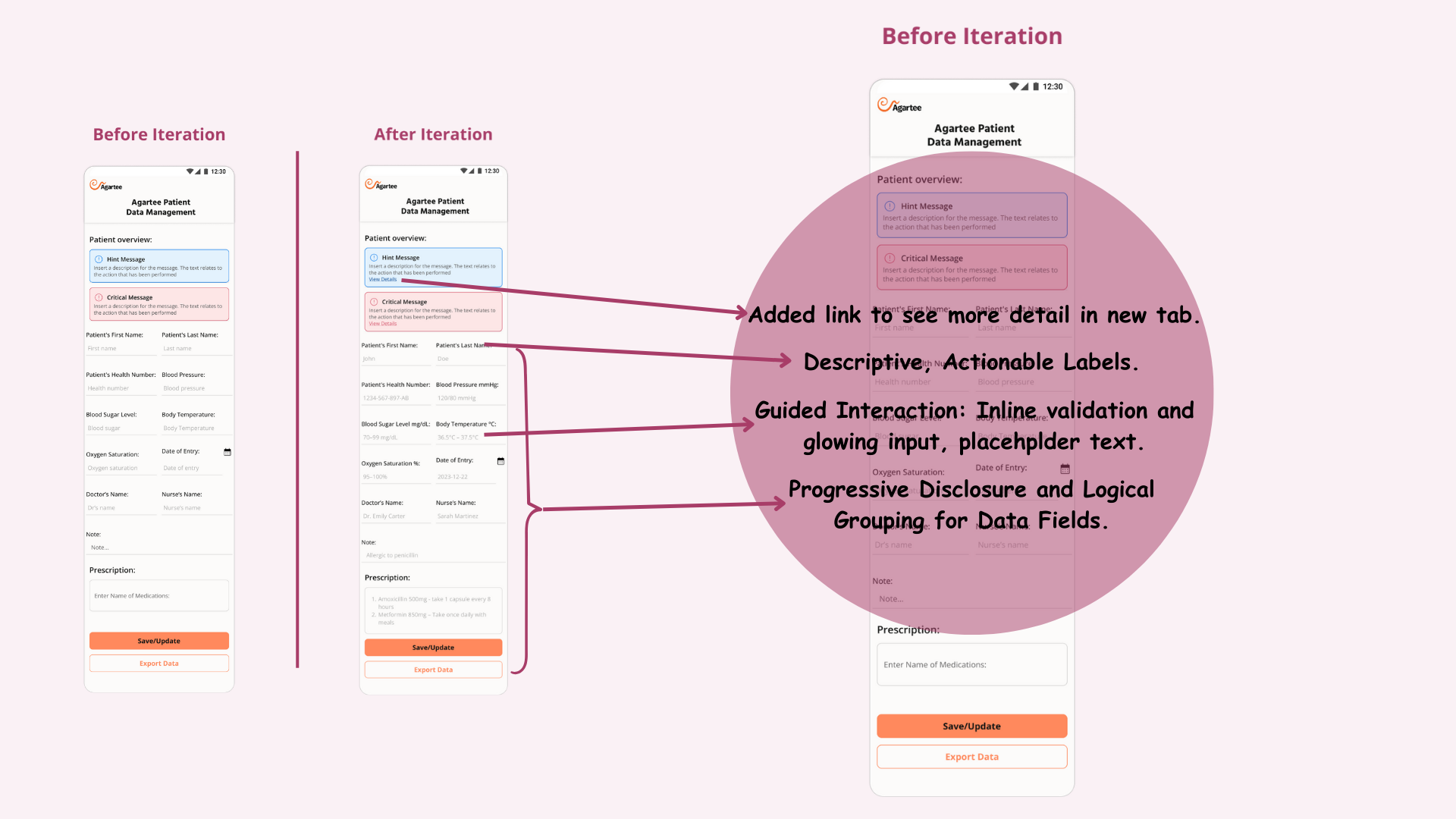
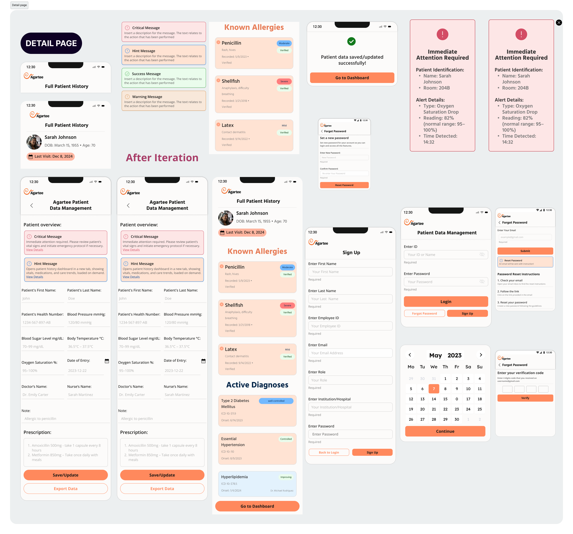
HOW I SOLVED THESE ISSUES
- Added clear, descriptive labels.
- Introduced inline validation and example placeholder text.
- Grouped related inputs logically and added glowing input highlights to guide focus.
- Email Subject Line Optimization → From "Reset Your Password" to: "Agartee: Your Password Reset Link (Expires in 30 Minutes)"
- Redesigned Email Body → clear CTA, estimated time to complete.
- Extended Link Expiry → from 10 to 30 minutes, plus countdown timer on the reset page.
- Alternative Recovery → SMS OTP, security questions, backup codes.
- Must-Have
- Should-Have
- Nice-to-Have
Used Progressive Disclosure + MoSCoW Prioritization to categorize:
- Urgent data visible on load
- Historical data and trends were moved to a secondary tab, accessed via a link, and lazy-loading implemented to improve performance.
Applied Progressive Disclosure in UI:
BEFORE/AFTER ITERATION
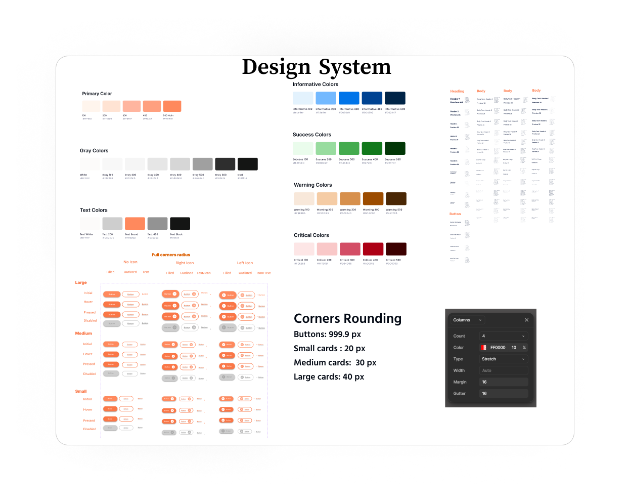
DESIGN SYSTEM UPDATES
VISUAL DESIGN
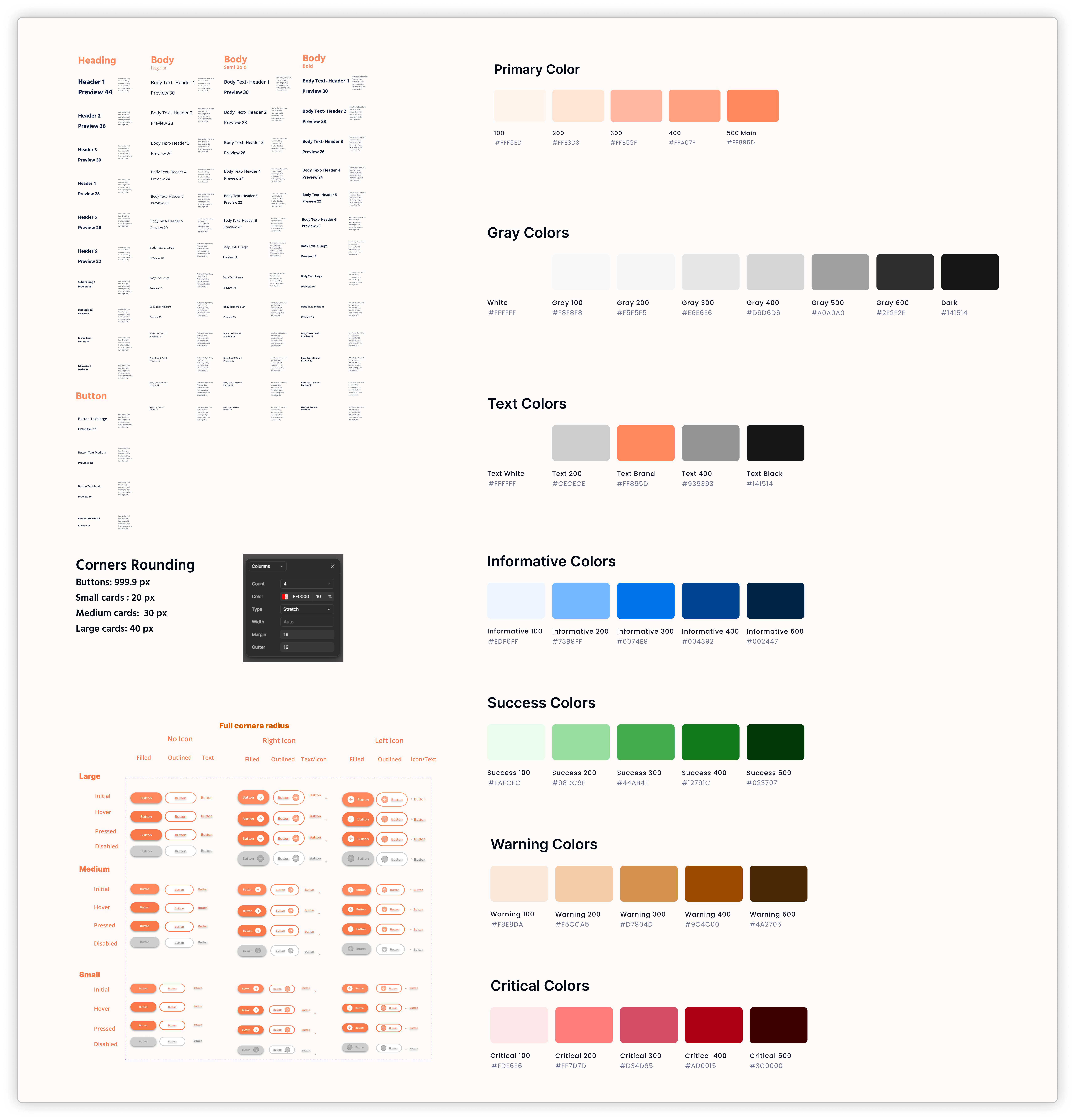
I updated the AGARTEE Design System, modernizing tokens for colors, typography, and spacing, ensuring alignment with existing flows and engineer needs.
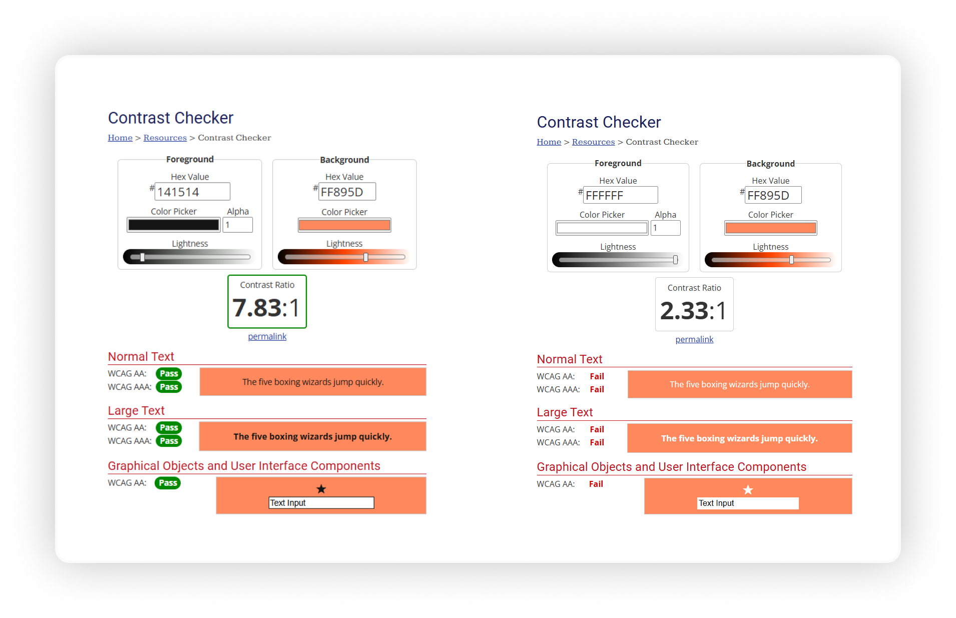
KEY FINDINGS
In our continuous effort to enhance the user experience within the Agartee Patient Data Management app, I made a significant discovery regarding the accessibility of our design elements. During a thorough review of the current color scheme, we found that the text color used within our buttons, set at #FFFFFF (white), did not provide adequate contrast against the button background for all users, particularly those with visual impairments.
IMPORTANCE OF ACCESSIBILITY
Accessibility is crucial in design, ensuring that all users, regardless of their visual abilities, can effectively engage with our application. High contrast between text and background colors is essential for readability and comprehension. According to WCAG (Web Content Accessibility Guidelines), a contrast ratio of at least 4.5:1 is recommended for normal text to ensure legibility for users with visual disabilities.
HANDOFF
FIGMA BOARD
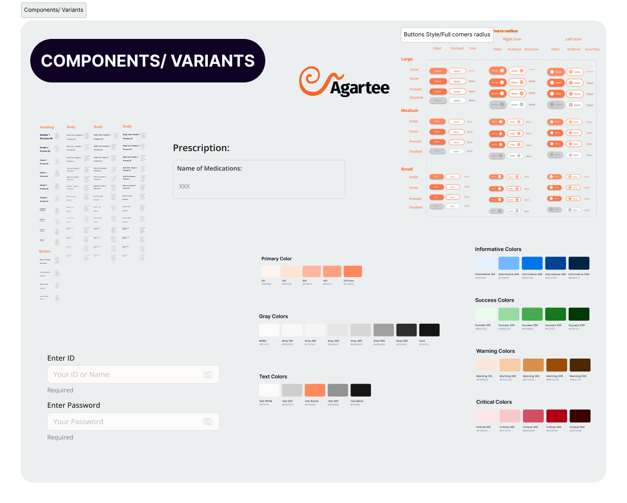
To ensure a smooth transition from design to development, I created comprehensive documentation and interactive prototypes that clearly communicate design intent, user flows, and component specifications. Key elements of the handoff process included:
- Design Specifications: Detailed annotations in Figma, including typography, buttons variants, and color codes.
- Interactive Prototypes: Clickable prototypes demonstrating user flows and interactions.
- Component Library: A comprehensive library of reusable components with guidelines for usage.
PROTOTYPE VIDEO
The video showcases the final interactive prototype of the Agartee Patient Data Management App. This walkthrough highlights the seamless user experience designed for healthcare providers, emphasizing:
- Intuitive Navigation
- Consistent UI Patterns
- Accessibility & Responsiveness
This prototype reflects close collaboration with clinicians, iterative testing, and careful attention to both functional and emotional needs. It stands as the blueprint for development and rollout.
RAPID REACTION & ITERATION
The launch marked the start—not the end—of continuous improvement. I established a robust feedback loop built on remote usability tests, A/B experiments, and direct user interviews, allowing us to capture authentic insights from frontline staff across multiple facilities without disrupting care.
- Accessibility Improvements:
- Glove-Friendly Interactions:
Early remote A/B tests showed that older clinicians struggled with small text and brief UI cues. By increasing font sizes, simplifying language, and introducing on-hover tooltips.
Post-launch, remote usability feedback from staff highlighted continued problems with touch responsiveness when wearing gloves. In response, I rapidly prototyped and launched larger, widely-spaced touch targets. Follow-up remote testing demonstrated a 20% rise in task completion rates for glove-wearing users.
DATA-DRIVEN ENHANCEMENT
- Ongoing Remote Experiments:
- Accessibility as a Continuous Standard:
I regularly launched A/B interface tests and monitored usage analytics to optimize error rates, navigation times, and feature discoverability—all managed remotely to maximize coverage.
Instituted quarterly remote accessibility and usability audits, ensuring all updates maintain inclusive design standards as the app evolves.
DRIVING FUTURE INNOVATION
Despite improvements, I conceptualized a hands-free interface to address the limitations of touchscreens in sterile, high-speed environments. I proposed a transition to natural language voice commands for documenting vitals and retrieving patient data, establishing a vision for future development that prioritizes speed and hygiene.
WHAT I'M WORKING ON NOW
- Collaborating cross-functionally to extract predictive insights from patient data, supporting proactive care.
- Leading organizational efforts in accessibility and post-launch measurement, with all research activities conducted efficiently and securely in a remote-first model.
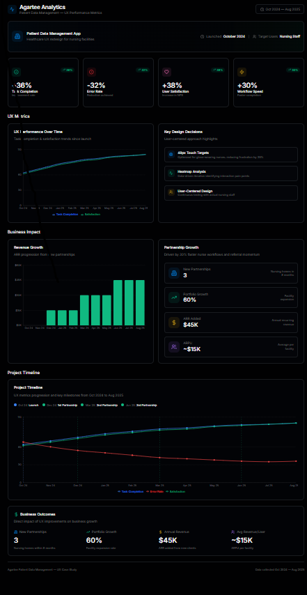
QUANTIFIABLE RESULTS SUMMERY
| Metric | Iteration 1 | Iteration 3 | Improvement (%) |
|---|---|---|---|
| Task Completion Time | 4.5 minutes | 2.8 minutes | 36% Faster |
| Error Rate | 12% | 8.2% | 32% Reduction |
| User Satisfaction Score | 4.1 / 10 | 5.7 / 10 | 38% Increase |
| Task Success Rate | 78% | 95% | 22% Increase |
| Design Time | Baseline | Improved | 35% Reduction |
| Developer Rework | Baseline | Improved | 40% Reduction |
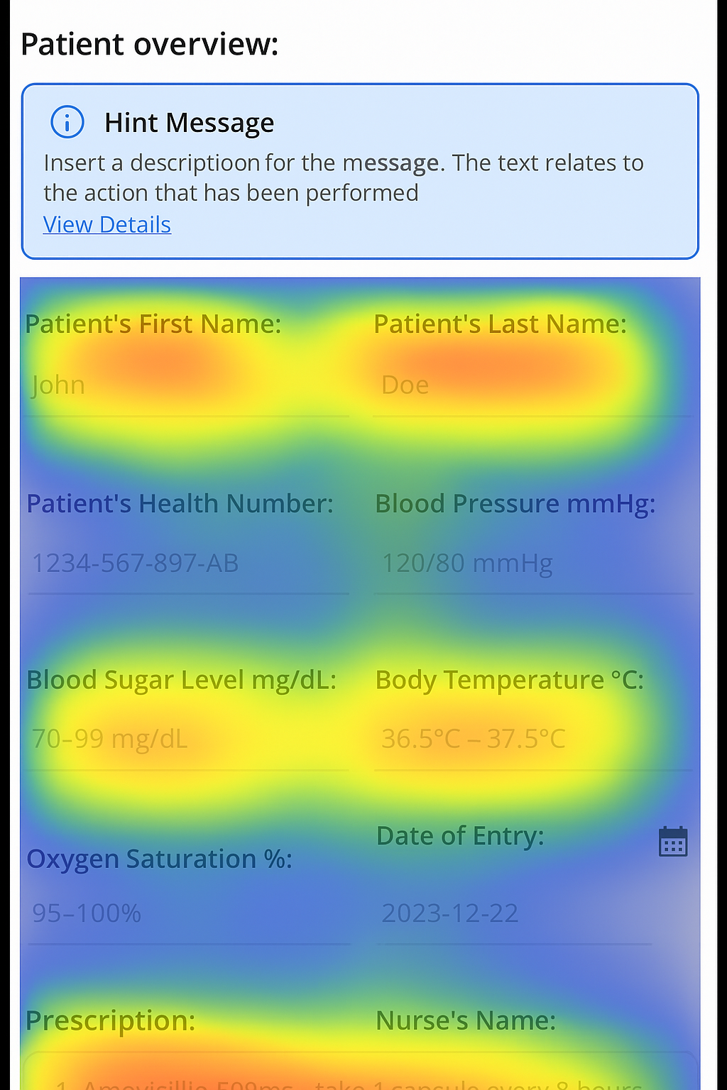
HOTJAR AND GOOGLE ANALYTICS RESULTS
RANGE CLICKS
Reduced by 35%, per heatmap analysis, highlighting the success of 48px touch targets in minimizing frustration for glove-wearing nurses.
KEY PERFORMANCE METRICS
After launching the Agartee "Patient Data Management" app, task completion rates improved to 36%, the error rate dropped by 32%, and user satisfaction increased to 38%, demonstrating the effectiveness of our user-centered design approach.
These performance improvements were instrumental in securing two new nursing home partnerships, expanding from three to five facilities after launching the app.
This project provided valuable insights into the challenges of designing for high-stakes healthcare environments where accuracy, speed, and clarity are essential. Key takeaways include:
- Balancing complexity and simplicity: Designing an interface that consolidates critical patient information without overwhelming users required iterative refinement and close collaboration with clinical staff.
- Importance of user research: Direct shadowing and interviews with nurses and pharmacists were essential for uncovering hidden pain points and validating design decisions, ensuring the product truly meets user needs.
- Data-driven iteration: Continuous feedback loops and analytics allowed us to measure impact, prioritize features, and optimize workflows effectively, reinforcing the value of an agile, user-centered approach.
- Cross-disciplinary collaboration: Working closely with engineers, product managers, and healthcare professionals highlighted the need for clear communication and shared goals to translate complex requirements into intuitive solutions.
- Adaptability and empathy: This project underscored the necessity of understanding users’ stressful, time-sensitive contexts and designing with empathy to create tools that genuinely support their work.