
Optimizing the Digital Experience for Héma-Québec Donors
Project information (Academic Project)
- CategoryUX design course
- RoleUX Researcher and Designer
- ClientHéma-Québec
- Project TimelineFall 2019
- ToolsAxure RP, Canva, Powtoon
- Belog URL WIX Blog
- Try the Prototype
Introduction
I completed a UX Design course, and as part of my training in the E-commerce major at HEC University in Montreal, I was tasked with redesigning Héma-Québec's website and the mobile app landing page design.
Project Overview
This case study details an academic project conducted during a UX design course, focused on enhancing the digital experience for blood donors at Héma-Québec. The aim was to address the organization's need for a more engaging and user-centered digital platform to better serve its diverse donor base.
Problem Statement
As of 2019, Héma-Québec's digital presence was static and lacked personalization, which limited donor engagement and retention. This project seeks to transform the digital experience into one that is interactive, relevant, and tailored specifically to the needs of both current and prospective donors.
Challenges
- User Engagement: Transitioning from traditional donor recruitment methods to a digital-first strategy to attract a younger audience.
- Feature Identification: Determining critical features, such as online appointment booking and personalized user profiles, that enhance the donor experience.
- User-Centered Design: Conducting thorough interviews to understand the diverse needs and preferences of different donor profiles.
Goals
- Conduct User Research: Perform interviews with various donor profiles to gather insights into their needs, challenges, and interactions with Héma-Québec's digital platforms.
- Prototype Solutions: Develop and test prototypes that address the identified issues, ensuring that features are intuitive and add value to the user experience.
- Enhance Digital Presence: Create a dynamic online platform that supports personalized donor experiences, ultimately aiming to increase participation and retention among donors.
Solutions
- Personalized Dashboards: Providing users with a snapshot of their donation history and upcoming appointments.
- Interactive Appointment Booking: Simplifying the process for scheduling donations with real-time availability.
Data Exploration and Analysis:
As part of my academic project for a UX design course, my team and I conducted a series of interviews with blood donors at Héma-Québec to explore their experiences and motivations for donating blood.
Research Insights:
Following our initial interviews, our team identified key insights regarding the emotional drivers behind blood donation. Although interviewees perceived their decision to donate as spontaneous, they acknowledged the significant influence of family and friends. This led us to refine our design question:
Design Question:
How could we transform Héma-Québec's digital presence to create a dynamic experience that fosters a lasting relationship between the organization and its donors?
Insights from the Interview:
- Many donors perceive blood donation as a time-consuming task, which can deter them from donating more frequently.
- The mental barriers associated with blood donation, such as fear of needles and concerns about judgment during the donation process, play a significant role in donor reluctance.
- The emotional connections and personal stories behind blood donation can be powerful motivators.
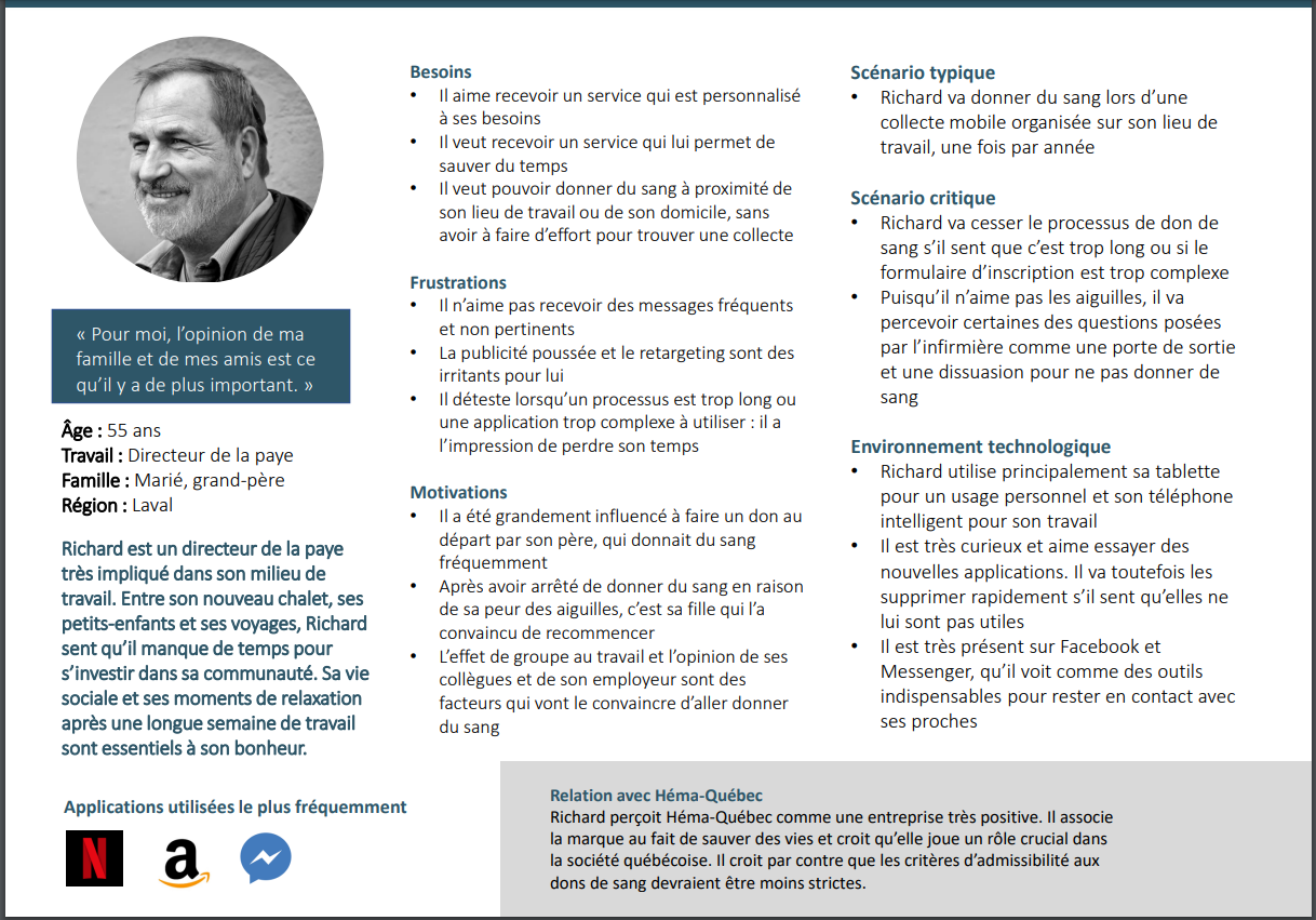
Persona:
Based on the findings from the interviews, we created an empathy map to visualize the participant's thoughts, feelings, and motivations. This map helped us identify areas for improvement in the donor experience and informed the creation of a detailed persona representing the typical donor.
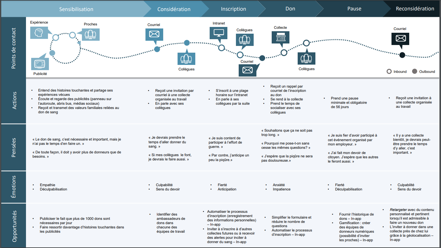
Journey Map:
Based on the findings from the interviews, we created an empathy map to visualize the participant's thoughts, feelings, and motivations. This map helped us identify areas for improvement in the donor experience and informed the creation of a detailed persona representing the typical donor.
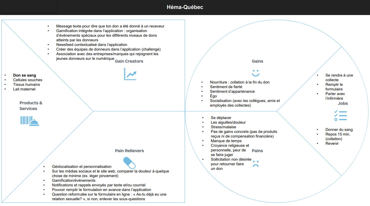
Empathy Map:
Our empathy map, informed by interview data, revealed key user needs and pain points. These insights directly shaped the design of Hema-Quebec, ensuring a user-centric approach.
Journey Mapping:
We created a journey map to visualize the user experience with Hema-Quebec, identifying key touchpoints and pain points. This helped us optimize the user flow and create a more seamless and efficient experience.
Card Sorting:
To better understand the information architecture of the Héma-Québec website, we organized a card sorting activity. Initially, we recruited several participants, but due to interruptions, only nine completed the exercise.
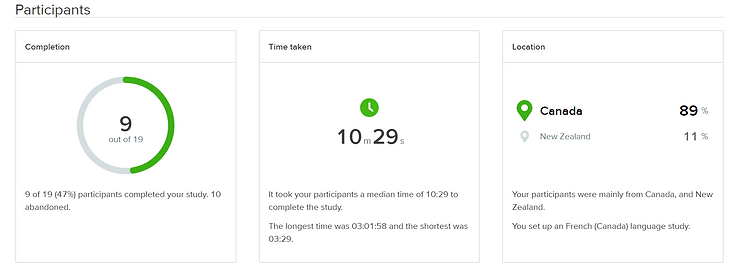
Key Findings:
- Grouping Hypotheses:
Our initial hypotheses about how users would associate information were largely validated. For example, participants commonly grouped "my information" with "badges," "donation history," and "appointments."
- Participant Insights:
During the exercise, one participant expressed confusion about the term "blood cell center," highlighting a gap in understanding that warranted further investigation.
- Language Influence:
The titles chosen by participants varied based on their language preference. English-speaking users opted for more welcoming phrases like "welcome back," while French speakers tended to use more straightforward terms.
- Challenges Identified:
The requirement for participants to categorize all cards may have led to random selections, as some cards were deemed irrelevant. Additionally, including category titles on cards caused confusion, as participants hesitated to use the same terminology for their own categories.
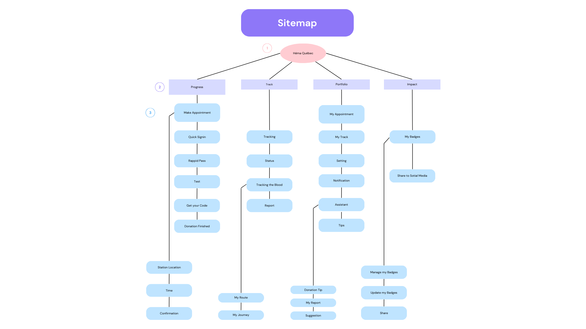
Sitemap:
The site map served as a blueprint for the Héma-Québec digital platform, ensuring that users could easily navigate through various sections while accessing essential information about blood donation.
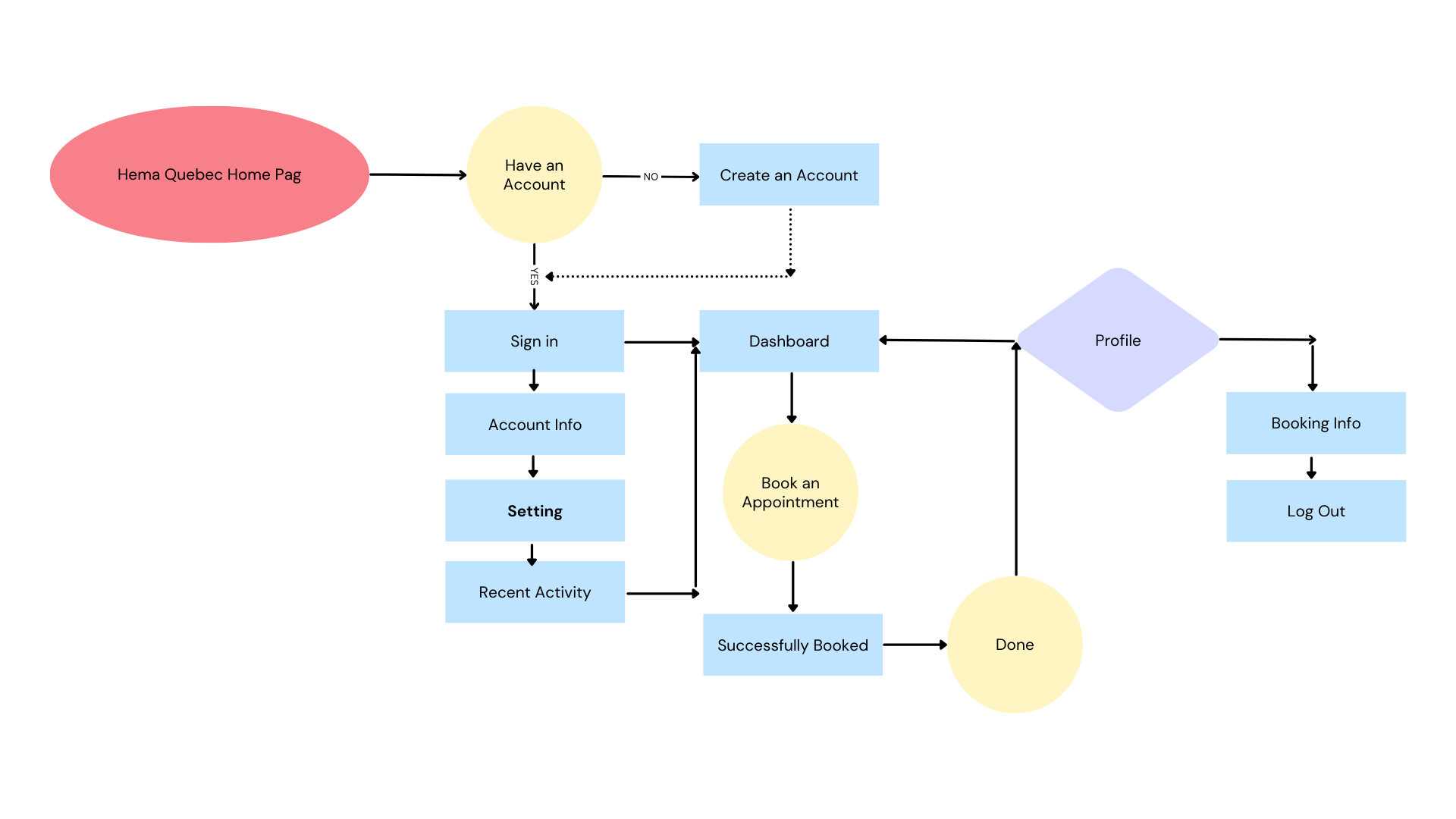
User Flow:
The user flow outlined the journey of a blood donor interacting with the Héma-Québec digital platform. This flow was designed to create a seamless and engaging experience, guiding users from initial awareness to successful donation.
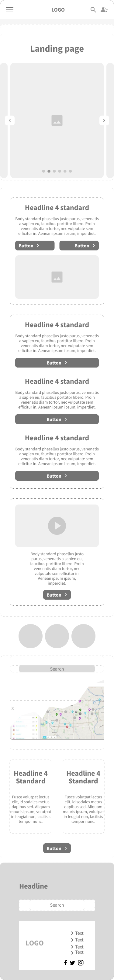
Mobile Wireframe for All Pages:
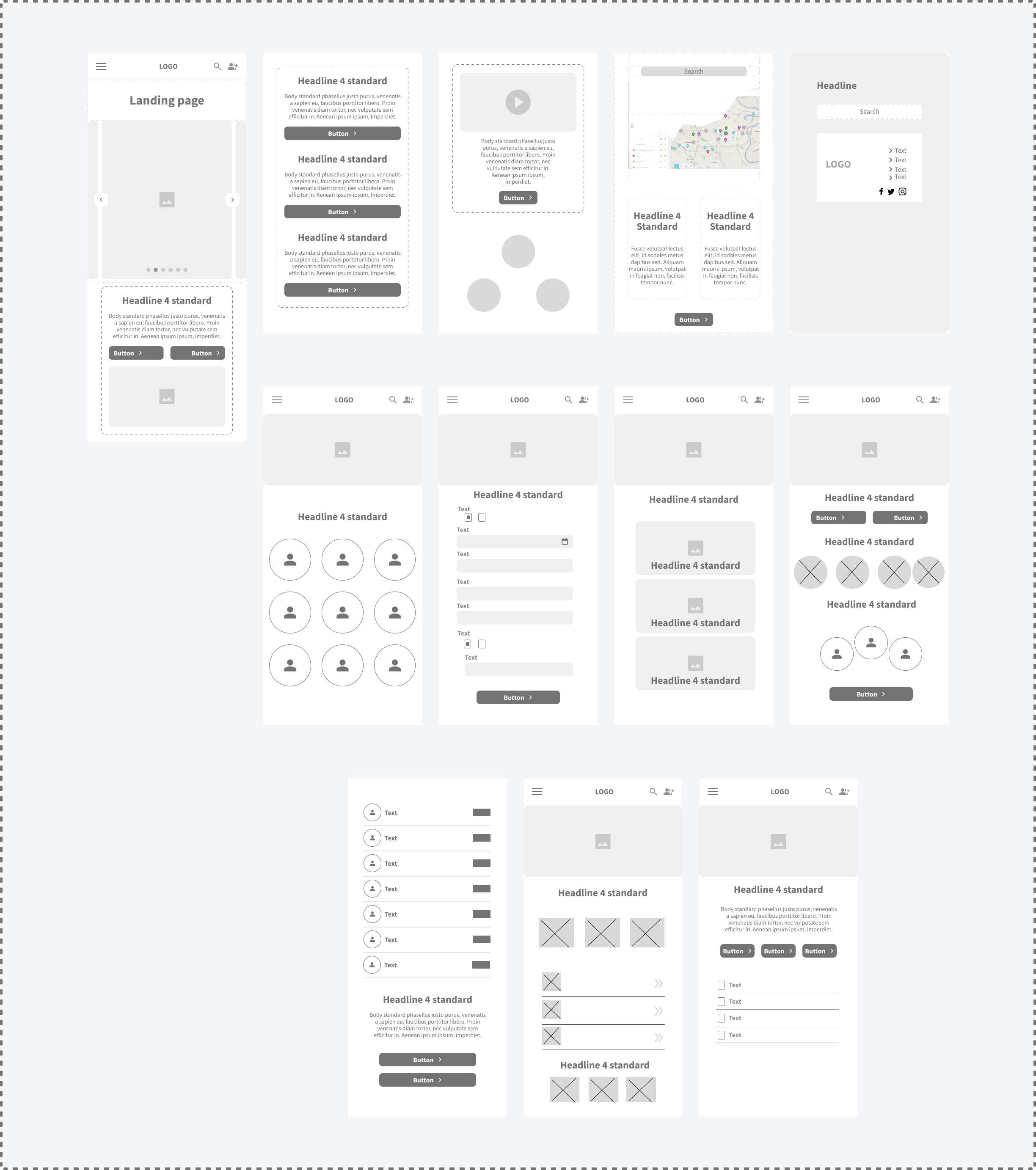
Mobile Landing Page Wireframe:
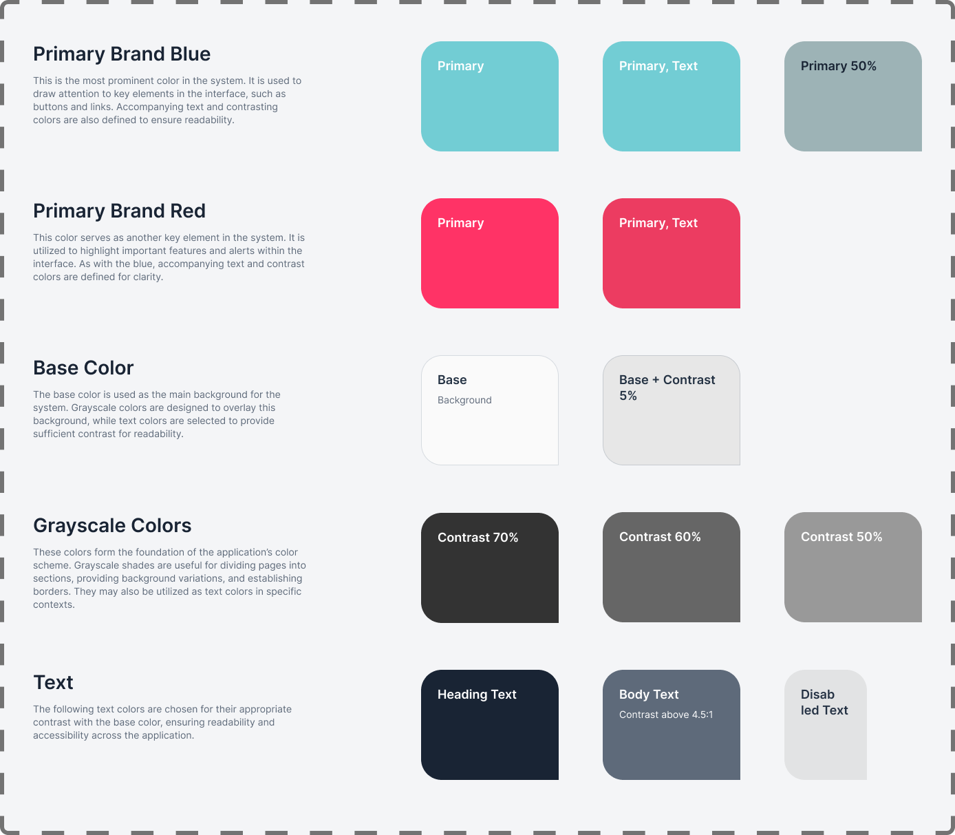
Color Palette:
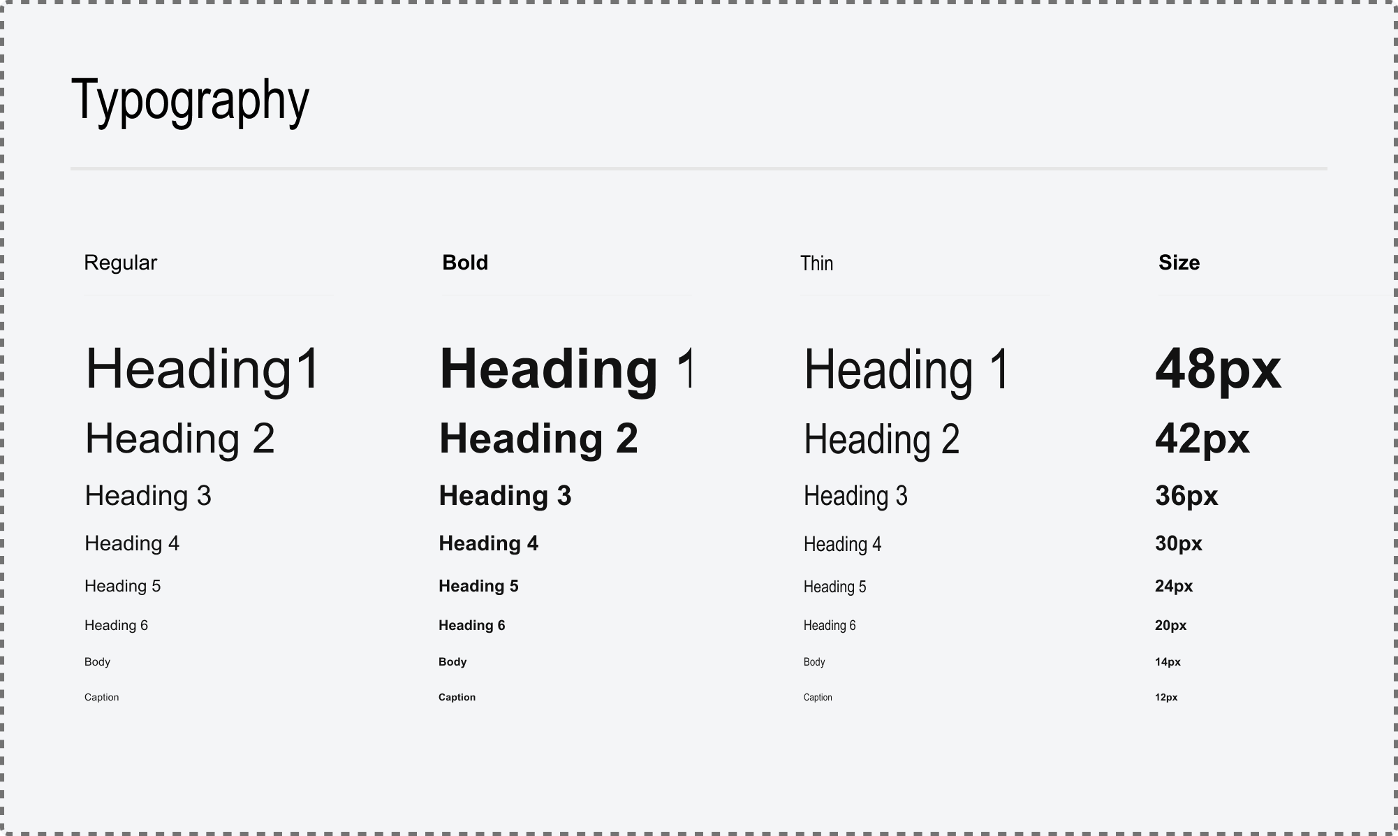
Typography:
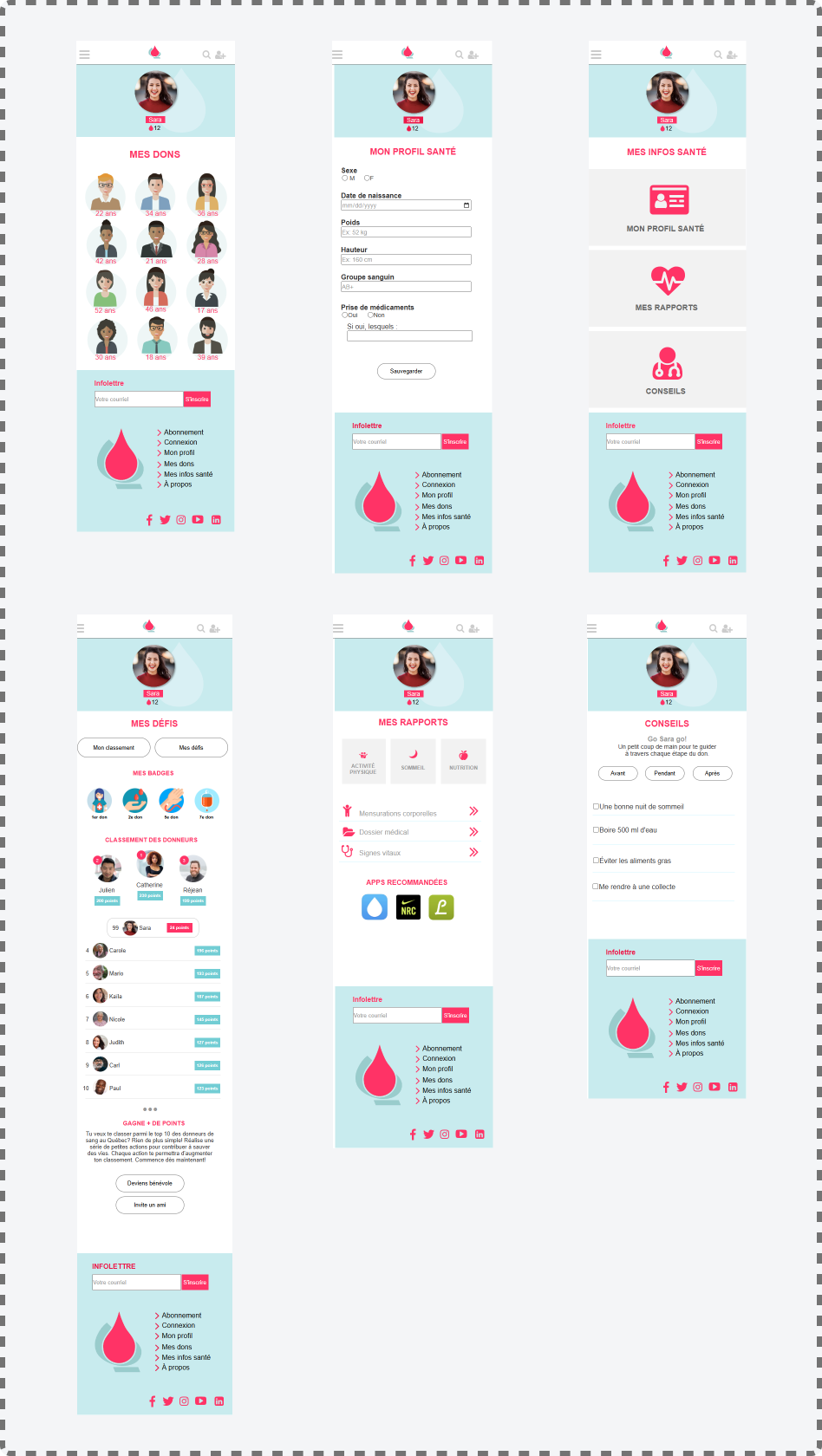
Mobile UI for All Pages:
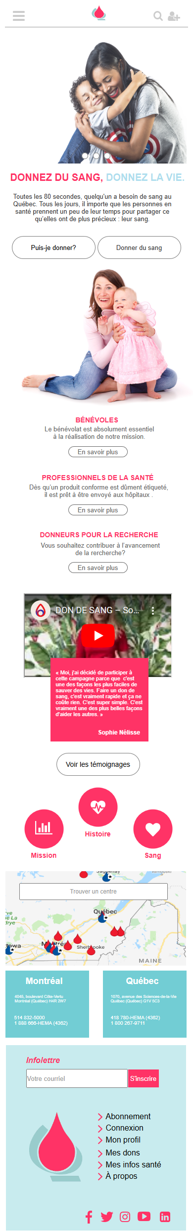
Mobile Landing Page UI:
This section presents key findings from user testing conducted on the Héma-Québec application prototype. Two participants completed tasks focused on challenge participation and profile management. The results highlight areas for improvement and inform design iterations.
Key Findings:
- Participant 1: Joining Challenges: Successfully understood the personal challenges section and reward system (badges). However, there was confusion regarding their inclusion in the displayed donor count (3 donors). The iconography representing donation counts and ranking was also unclear.
- Participant 1: Viewing Donor Badges: Successfully and easily located the badges section. The informational nature of this page was considered valuable to the donor experience.
- Participant 2: Joining Challenges: Experienced confusion regarding the term "My Challenges," questioning whether it referred to current or subscribable challenges. This led to hesitation during interaction with the page.
- Participant 2: Completing Health Profile Form: Successfully and easily completed the health profile form. The clarity of required information was noted as a positive aspect.
Overall Observations:
- The user testing, conducted on a more advanced prototype, provided more valuable insights into usability compared to previous heuristic evaluations.
- The iterative testing approach, making adjustments throughout the design process, ensures continuous improvement.
The Héma-Québec project has been a pivotal experience in my journey as a UX designer. Engaging in the redesign of the digital experience for blood donors allowed me to apply theoretical knowledge in a practical setting while emphasizing the importance of user-centered design.
Key Insights:
- Importance of User Feedback
- Clarity and Simplicity
- Iterative Design Process
- Collaboration and Communication